
Understanding of a Leaking Funnel
98 Out of 100 Visitors Are Leaving Without Buying
That is not a headline. That is the math. The average ecommerce conversion rate dropped to 1.70% in 2026, a 16% decline from 2023, according to IRP Commerce. Which means the overwhelming majority of the traffic you paid to acquire, nurtured through segmentation and orchestration across channels, is evaporating somewhere between landing and checkout.
The instinct is to buy more traffic. More impressions, higher bids, broader reach. But if the funnel underneath is broken, more traffic is just more wasted spend. The lever that most teams underuse is conversion: fixing what happens after the click, not before it.
Baymard Institute puts global cart abandonment at 70.19%.
The top causes: extra costs revealed too late in checkout (48%), mandatory account creation (26%), and overly complicated checkout processes (21%). None of those are acquisition problems. They are CX problems. The customer arrived with intent. Something on your site killed it.
A CRO audit is a structured diagnostic that finds where intent dies and why. This episode covers how to run one with insights on:
- the conversion killers hiding in plain sight,
- how to conduct a heuristic analysis,
- how to use analytics, heatmaps, and session recordings as a layered diagnostic system,
- the mobile-desktop gap that most sites are still bleeding through, and
- how to build an audit checklist built around your actual business model, not a generic template.
In episode 14, we covered cross-channel orchestration: delivering the right message through the right channel at the right moment. The CRO audit is what determines whether the destination that the message points to is actually built to convert.
The Conversion Killers Hiding in Your Funnel
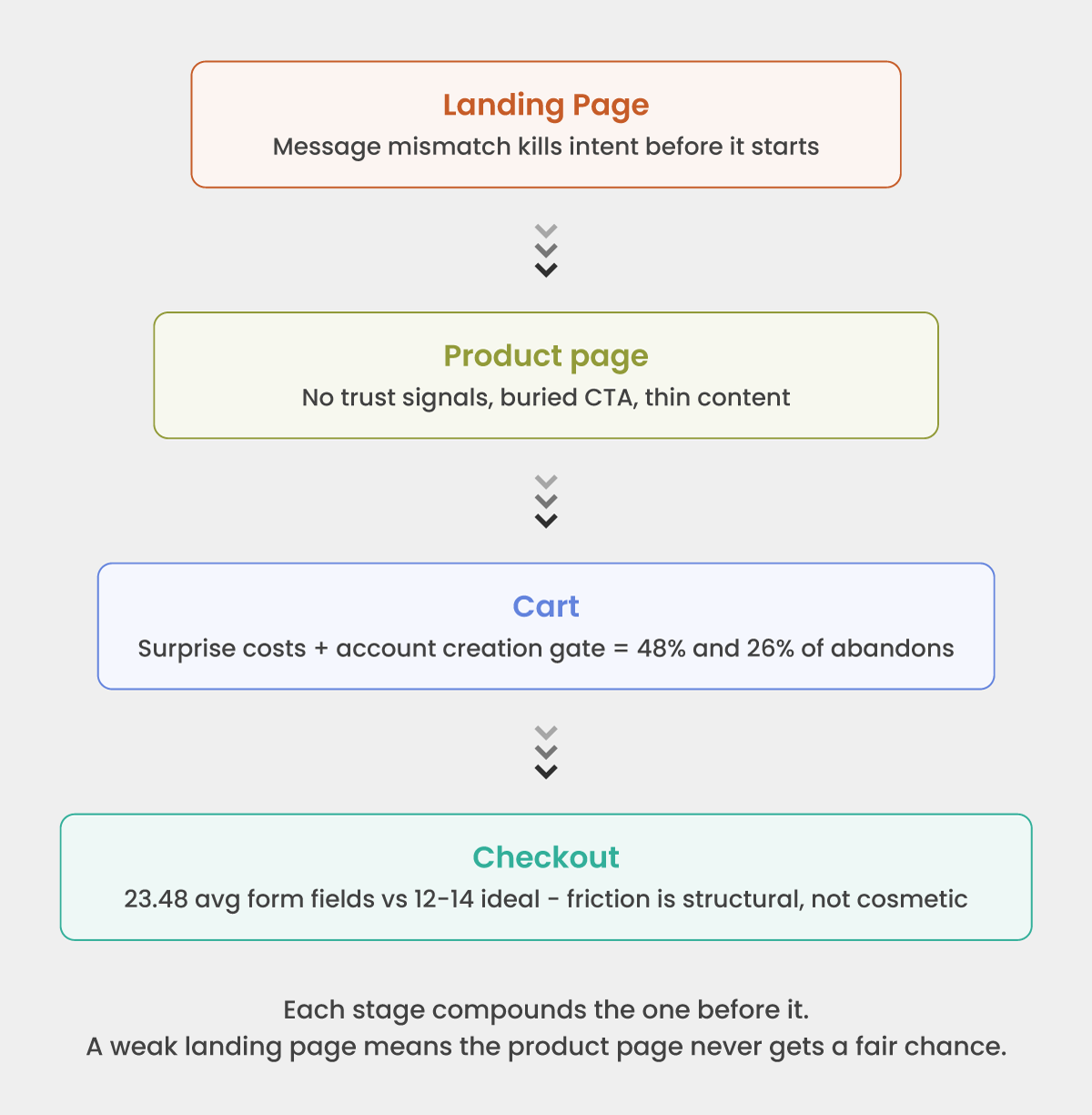
Most conversion problems are not isolated to a single page. They compound. A landing page that does not confirm relevance produces a product page visit with diminished intent. A product page that withholds trust signals produces a cart add with anxiety still attached. And a cart that reveals unexpected costs for the first time at step three produces an abandon that gets blamed on checkout, when the real failure started three steps earlier.
The killers that show up in almost every audit, regardless of vertical:
At landing and category level:
- Ad-to-page message mismatch: the visitor arrives expecting what the ad promised, finds something adjacent, and bounces in under ten seconds
- No visible value proposition in the first viewport without scrolling — especially on mobile, where the first screen is the only screen most visitors see
- Page load time above three seconds on mobile networks, which drops a measurable proportion of visitors before the page is even usable
At product page level:
- CTA buried below the fold on a 375px screen: no amount of copy optimization helps a button the visitor never sees
- Reviews, ratings, and trust signals positioned below the purchase action instead of adjacent to it, where the anxiety actually lives
- Delivery time and return policy missing from the product page entirely, forcing the visitor to navigate away to find information that should remove hesitation, not create a detour
At cart and checkout:
- The cost reveal: shipping fees, taxes, handling charges appearing for the first time at step three of a three-step checkout
- Mandatory account creation before purchase: a friction gate that converts brand-new customers into abandoned sessions at a 26% rate
- Form fields asking for information the business does not need to fulfill the order — phone number, date of birth, gender, account preferences — at the moment of maximum intent
- No mobile wallet option (Apple Pay, Google Pay) on a site where mobile drives the majority of traffic
- Navigation links present on checkout pages, offering every possible exit at the worst possible moment
The pattern is consistent: intent arrived, friction intervened, the customer left. The audit’s job is to locate every intervention point and assign it a revenue cost.
How to Conduct a Heuristic Analysis
A heuristic analysis is a structured walkthrough of your own funnel, using a defined evaluation framework, to surface conversion and usability problems before the data confirms them. It does not require a usability lab or an external consultant. It requires methodology, independence, and documentation discipline.
The most practical framework for ecommerce is the LIFT Model – six factors assessed at every key page:
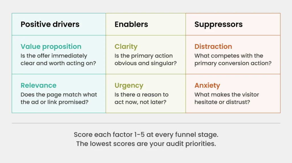
- Value proposition: Is it immediately clear what this page is offering and why it matters to this visitor?
- Relevance: Does the page match the expectation created by the ad, email, or link that brought the visitor here?
- Clarity: Is the primary action obvious? Is the page free of competing priorities?
- Urgency: Is there a reason to act now rather than return later?
- Anxiety: What might make a visitor hesitate? Missing trust signals, ambiguous policies, unclear pricing?
- Distraction: What elements are competing with the primary conversion action?
How to run it practically:
Walk every key page of your conversion funnel: landing page, category page, product page, cart, checkout initiation, payment, confirmation. At each page, score each LIFT factor from 1 to 5 and note specific elements driving the score. Do not run this on a desktop browser only. Run it on a mid-range Android device at a throttled 3G connection. That is closer to how a significant portion of your actual visitors experience the site.
Involve someone who has not worked closely on the site. Familiarity is the enemy of heuristic analysis. The person who built the checkout flow cannot see what a first-time visitor sees.
Document findings as hypotheses, not conclusions. “The shipping cost reveal at step 3 may be causing abandonment at the payment page” is a testable hypothesis. “The shipping cost reveal is bad” is an opinion. The distinction matters when you prioritize what to fix.
Using Analytics, Heatmaps, and Session Recordings to Find Friction
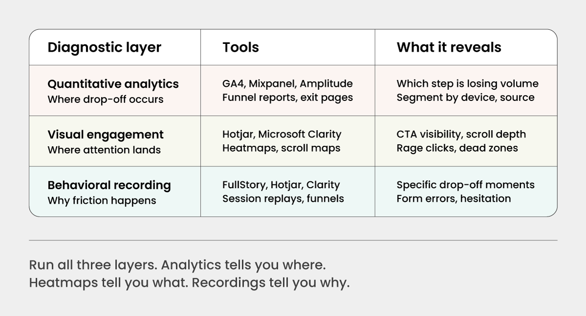
The three diagnostic layers build on each other. Running only analytics tells you where traffic is dropping. It does not tell you why. Running only session recordings is anecdotal without the volume data to tell you which pages are worth the investigation time. The 3 layers together give you a complete picture.
Layer 1: Quantitative analytics: finding where drop-off occurs
Start with your funnel report. Map every step from landing to conversion: landing page → product page → add to cart → checkout initiation → payment entry → order confirmation. Record the step-by-step drop-off rate at each transition. The step with the largest absolute volume loss is your first priority, not the step with the highest percentage drop.
Segment the funnel by device (mobile vs desktop), traffic source (paid vs organic vs email), and new vs returning visitor. A checkout abandonment rate of 65% overall may be 45% for desktop and 82% for mobile. That is two different problems with two different solutions, and the blended number obscures both.
Look specifically at:
- Exit rate on the product page: a high exit rate here is a content or trust problem, not a checkout problem
- Drop between cart and checkout initiation: often a surprise cost or account creation gate
- Drop between payment entry and order confirmation: usually form friction, payment method gaps, or security anxiety
Layer 2: Heatmaps and scroll maps: finding where attention lands
Once analytics has identified the high-priority pages, apply heatmap and scroll depth data to understand what visitors are actually engaging with.
On product pages, check whether the primary CTA (add to cart) is above the fold on mobile without scrolling. If scroll data shows 60% of visitors never reach the CTA, the problem is layout, not the button copy. Check where click density is highest. If visitors are clicking on non-clickable elements, that is a design confusion signal.
Rage clicks (repeated rapid clicks on an element) indicate frustration with an element that appears interactive but is not responding. Dead zones, areas with no click or hover activity, often indicate that important content is not being seen at all.
Layer 3: Session recordings: finding why friction happens
Session recordings are where hypotheses get confirmed or eliminated. Filter recordings to sessions that include the high-drop-off steps identified in analytics. Watch 20 to 30 sessions for each major friction point. You are not looking for statistical proof. You are looking for patterns.
Common patterns to watch for:
- Users who fill in a form field, encounter an error, and abandon rather than correct it
- Users who scroll back up after reaching the payment step, usually looking for missing information like returns policy or delivery time
- Users who pause at a specific field, indicating confusion about what is being asked
- Users who reach the cost reveal, pause, and immediately navigate away
Every pattern is a hypothesis. Document it, prioritize it by frequency, and move it into the testing backlog.
Mobile vs. Desktop: Where Conversion Rates Differ and Why
Data from more than 1.9 billion shopping sessions shows desktop conversion rates at more than triple those of smartphones. Meanwhile, mobile drives the majority of traffic.
That gap is the single largest untapped conversion opportunity on most ecommerce sites, and it is almost entirely a UX problem, not an audience quality problem.
The same customer, on the same intent, converts at a fraction of the rate on mobile because the experience is built for desktop and adapted for mobile as an afterthought.
Where the gap shows up most clearly:
- Form entry. Desktop keyboards allow fast, accurate input. Mobile keyboards cover half the viewport, autocomplete often fails on non-standard field labels, and a single validation error that clears the form causes complete abandonment far more often on mobile.
- Navigation and layout. Product pages designed for desktop often bury the CTA below the fold on a 375px screen. Images that load acceptably on broadband stall on mobile networks. Hover-dependent interactions (dropdown menus, tooltip trust signals) simply do not exist on touchscreens.
- Payment friction. A 16-digit card number entry on a mobile keyboard is a meaningful barrier. Mobile wallet options (Apple Pay, Google Pay) collapse that to a single biometric confirmation. Stores that do not offer wallet payment on mobile are self-imposing friction.
- Trust signals at scale. Security badges, review summaries, and guarantee copy that are clearly visible on a desktop viewport often collapse into the footer or below-fold on mobile, removing the trust architecture at the exact point where mobile visitors are most anxious about payment.
The practical starting point for mobile auditing:
Run your heuristic analysis and session recordings separately for mobile. The friction points are different. A mobile CRO audit is not a desktop audit done on a smaller screen. It is a distinct exercise with distinct priorities: load speed, form simplicity, CTA visibility above the fold, wallet payment availability, and thumb-zone placement of every interactive element.
Building Your CRO Audit Checklist
The value of a CRO audit is not the individual findings. It is the structured, repeatable process that surfaces findings consistently over time. A one-off audit is a diagnostic. A recurring audit cadence is an optimization system.
The audit checklist should be organized by funnel stage, not by page template. Every business has a different site architecture, but every business has the same funnel structure: awareness, consideration, intent, conversion, confirmation. The checklist maps to those stages.
Landing and category pages:
- Does the headline match the ad or link that brought this visitor here?
- Is the value proposition clear in the first viewport, without scrolling?
- Are filters and sorting functional and prominent?
- Is page load under three seconds on a throttled mobile connection?
Product pages:
- Is the primary CTA visible above the fold on mobile?
- Are reviews, ratings, and social proof present near the purchase action?
- Are delivery time and return policy visible without navigating away?
- Are product images sufficient in number, quality, and context?
Cart:
- Are all costs shown in full, including estimated shipping and tax, before checkout initiation?
- Is there a guest checkout option that does not require account creation?
- Is the path from cart to checkout a single step?
Checkout:
- Is navigation removed from the checkout page?
- Is a progress indicator present on multi-step flows?
- Are form fields minimal and clearly labeled?
- Is autofill enabled on address and payment fields?
- Are mobile wallet options available?
- Are security badges and trust signals visible at the payment step?
- Is the error state clear, specific, and does it preserve previously entered data?
Post-purchase:
- Does the confirmation page confirm the key details: order number, delivery estimate, return instructions?
- Is there a next-step prompt that does not feel like an immediate upsell?
Adapt the checklist to your business model. A subscription product has a different conversion risk profile than a one-time high-ticket purchase. A B2B procurement flow has different anxiety points than a consumer impulse purchase. The checklist above is the structural foundation. Layering your own funnel data, session recording patterns, and heuristic findings onto that foundation is what makes it yours.
Run the checklist on a defined cadence: a full audit every quarter, a targeted review of high-drop-off pages every month. Between audits, every failed A/B test is an audit finding. Every user support ticket referencing checkout confusion is an audit signal. An optimization culture treats those signals as data, not noise. For a detailed 28-point DIY CRO audit, here is an ebook you can refer too.
Finally: Audit First, Then Test
The testing instinct in CRO is strong. When conversion rates are low, the impulse is to start running A/B tests immediately: button color, headline copy, CTA placement. Some of those tests will win. Most will not, because they are testing hypotheses that were not grounded in a diagnostic.
The audit is what gives the test a reason to exist. A session recording that shows 30% of mobile visitors scrolling back up from the payment page to find the returns policy is a precise hypothesis: making the returns policy visible at the payment step will reduce abandonment. That test has a clear mechanism, a specific audience, and a measurable outcome. A test run without that upstream work is a guess with a dashboard.
At Krish, our CRO and A/B testing services and CRO audit capabilities are built on exactly this sequence: audit to find the friction, prioritize by revenue impact, test with a defined hypothesis, and measure against a holdout.
Because CRO without an audit is optimization theater. It looks like systematic improvement. It is not.
Table of Content
- Understanding of a Leaking Funnel
- The Conversion Killers Hiding in Your Funnel
- How to Conduct a Heuristic Analysis
- Using Analytics, Heatmaps, and Session Recordings to Find Friction
- Mobile vs. Desktop: Where Conversion Rates Differ and Why
- Building Your CRO Audit Checklist
- Finally: Audit First, Then Test
Subscribe with Us!
Never miss any post, stay tuned!
Ankit helps brands navigate their digital maturity journey by bringing together analytics, CRO, ML, and AI in a practical, business-friendly way. Having worked with global teams across industries, he focuses on simplifying complex MarTech concepts and turning them into measurable outcomes. On weekends, you’ll likely find him deep in a reflective read or sharing a coffee with a client while simplifying MarTech in the most human way possible.
Recommended Reading:

Why Analytics Alone Cannot Explain User Behavior? – Conversion Maturity Series | EP 03
3 June, 2026 A crime scene report tells you what happened. Time of death, method, location. It does not tell you motive. It does not name the perpetrator. That requires a detective.Your analytics dashboard works exactly the same way. It tells you a page has a high exit rate, a form has low completion, and your mobile sessions convert at a fraction of the rate on desktop. But it has no opinion on why. And in CRO, why is the only question that leads to a test worth running.
Subscribe with Us!
Never miss any post, stay tuned!
Trusted by leading brands


