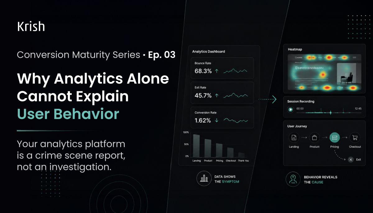
Your analytics platform is a crime scene report, not an investigation
A crime scene report tells you what happened. Time of death, method, location. It does not tell you motive. It does not name the perpetrator. That requires a detective.
Your analytics dashboard works exactly the same way. It tells you a page has a high exit rate, a form has low completion, and your mobile sessions convert at a fraction of the rate on desktop. But it has no opinion on why. And in CRO, why is the only question that leads to a test worth running.
This matters practically because,
Analytics-only diagnosis produces analytics-only hypotheses.
“Exit rate is high on the pricing page, so let’s redesign the pricing page.” That is a guess dressed as strategy. The exit rate is a symptom. The cause could be missing information, a trust gap, a confusing layout, a price point that breaks the value equation, or simply that most visitors on that page aren’t buyers. Redesigning without knowing which problem you’re solving is the fastest way to run experiments that produce nothing.
According to Forrester, most organizations measure activity volume rather than behavioral quality. Sessions, pageviews, bounce rates. These describe traffic patterns. They do not describe decision-making. That gap is where revenue gets lost while dashboards look healthy.
Issue 01 revealed the leak. Issue 02 defined what you’re actually measuring. Now the harder problem: your dashboard is full of answers to questions nobody asked.
What analytics tells you vs what you actually need to know
Quantitative data tells you where. Qualitative data tells you why. Most teams only use one.
The distinction isn’t philosophical. It’s operational. Without quantitative data, you can’t find the drop-off points worth investigating. Without qualitative data, you can’t understand what’s actually happening at those points. One without the other produces either guesswork dressed as analysis, or evidence with no direction.
The diagram below shows how both lenses fit together in a diagnostic workflow.
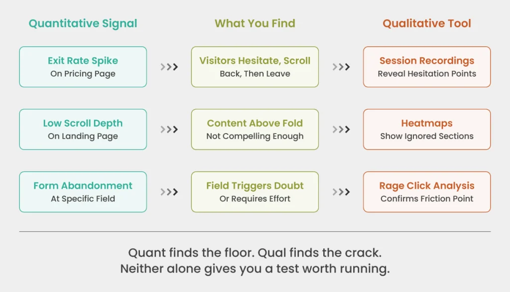
This is the diagnostic loop that precedes every experiment worth running. The analytics surface the signal. The behavioral tools explain it. Together they give you a hypothesis with actual evidence behind it.
The 4 behavioral tools and what they actually tell you
Most teams know these tools exist. Few use them with enough precision to generate hypotheses worth testing.

1. Heatmaps
They show aggregate attention across a page. But the insight isn’t “where do people click.” It’s the anomalies. Clicks on a non-linked product image mean visitors expected interactivity you didn’t build. A scroll cut-off at 38% means your value proposition sits below a line most visitors never cross. Move heatmaps on desktop reveal where attention concentrates before a decision is made. That concentration tells you whether your page architecture is guiding visitors or abandoning them mid-journey.
2. Session recordings
The closest a CRO practitioner gets to watching a real visitor make a decision. According to Hotjar’s guide to session recordings, recordings surface issues and opportunities that aren’t obvious from an analysis based on numbers. Watch twenty recordings of users who exited a specific page without converting. With a specific question. “We believe visitors are leaving because they cannot find the proof they need to trust this claim.” That question changes what you see. A visitor who scrolls rapidly to the bottom and exits was looking for something absent. A visitor who lingers on a testimonials section then exits was nearly convinced. Different problems. Different tests.
3. Rage click analysis
The most underused signal in CRO. A rage click cluster means a visitor tried to do something your page didn’t let them do. That broken expectation costs you a conversion and costs your competitor nothing. It will not show up as anything dramatic in your analytics. Just a marginally elevated exit rate on a page that “seems fine.”
4. Form-level analytics
The field-by-field depth. Drop-off rate per field. Time-on-field. Re-entry rate, and more. According to Baymard Institute’s checkout research, the average checkout contains 11.3 form fields while most sites only need 8, and 18% of users abandon due to checkout complexity. But “unnecessary” is specific to your form, your audience, and your context. Field analytics tells you which fields are costing you completions in your funnel. You cannot get that from a total form abandonment rate.
The sequence nobody follows but everybody should
Great CRO programs don’t use behavioral tools instead of analytics. They use them after analytics, in a specific order, with a specific question already formed.
Here is the sequence that turns behavioral observation into a testable hypothesis rather than an interesting collection of recordings:
- Analytics flags an anomaly: a stage, a page, a segment performing below benchmark
- Isolate the affected path: not the whole site. The specific journey where the anomaly lives
- Form a question before opening any tool: “We believe X is happening because of Y”
- Use the right behavioral tool to confirm or discard that belief
- Write the hypothesis: “If we change X, conversion at this stage will improve because behavioral evidence shows Y”
That last step is where most teams stop short. They find the rage click cluster. They note it. They do not write a formal hypothesis. Without a hypothesis, there is no test. Without a test, there is no learning. Without learning, behavioral analysis is just an expensive form of watching people use your website.
This is the methodology behind Krish’s CRO audit practice: quantitative funnel analysis first to locate the leak, behavioral observation second to understand it, hypothesis third to fix it. The order is not optional.
DIY: What you should audit this week
If you run nothing else from this issue, run these four checks on your highest-traffic, lowest-converting page:
- Pull session recordings filtered to exits only, on that page, last 30 days. Watch 20. Write down every moment a visitor paused unexpectedly or clicked something non-interactive.
- Open your heatmap for that page on mobile. Find where scroll depth cuts off. Everything below that line is invisible to most of your mobile visitors.
- Check for rage click clusters on the page. If any exist on a non-CTA element, you have a broken expectation that is actively costing conversions.
- If the page has a form, pull field-level drop-off data. The field with the highest drop-off rate is your first test candidate.
Four checks. One page. You will have more hypotheses than you can test in a sprint. That is the right problem to have.
Up next, we talk money. Issue 04 is precisely about: The Hidden Cost of Friction in Digital Journeys. Stay with us, and in the meantime, feel free to reach out to our CRO experts for a detailed discussion.
Table of Content
Subscribe with Us!
Never miss any post, stay tuned!
Ankit helps brands navigate their digital maturity journey by bringing together analytics, CRO, ML, and AI in a practical, business-friendly way. Having worked with global teams across industries, he focuses on simplifying complex MarTech concepts and turning them into measurable outcomes. On weekends, you’ll likely find him deep in a reflective read or sharing a coffee with a client while simplifying MarTech in the most human way possible.
Recommended Reading:
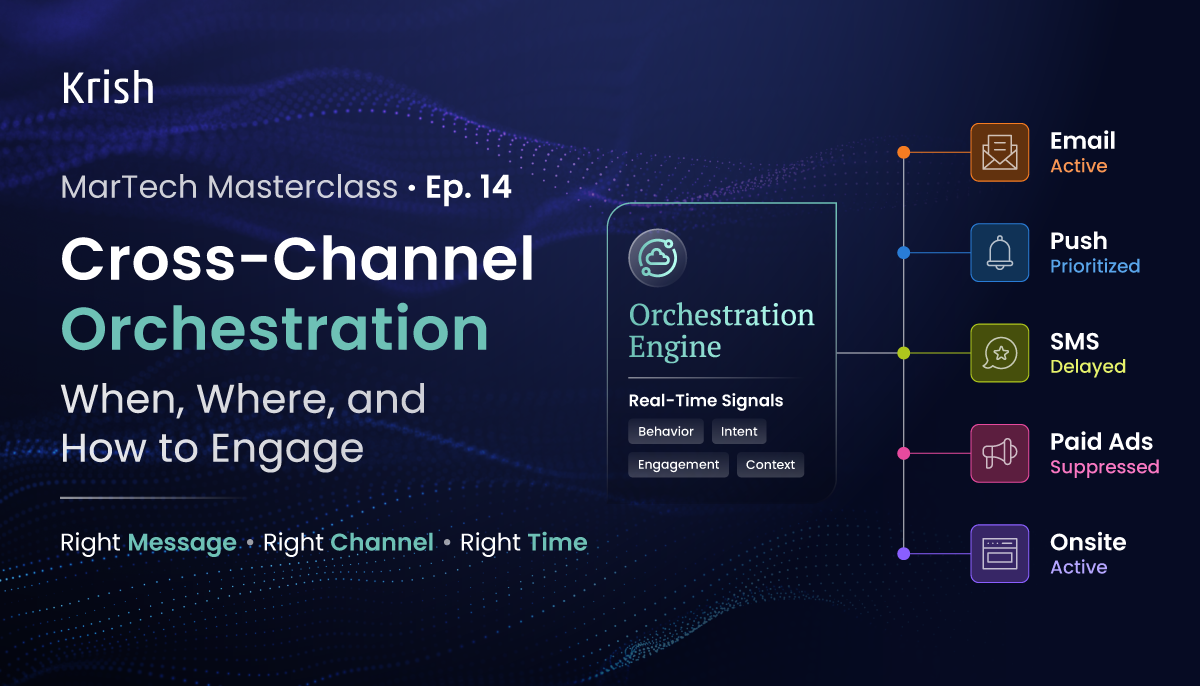
Cross-Channel Orchestration: When, Where, and How to Engage – MarTech Masterclass Series Ep | 14
27 May, 2026 Most brands running five channels are not doing cross-channel marketing. They are doing single-channel marketing five times over. The email team has its own calendar, its own KPIs, its own definition of a good week. Same for SMS, push, paid, and web. No shared view of what the customer has already received. No suppression logic that crosses a channel boundary. No agreed moment when one channel yields to another. The customer who buys on Monday is still getting a conversion-push on Wednesday because the paid retargeting audience sync runs nightly and someone forgot to check.
Subscribe with Us!
Never miss any post, stay tuned!
Trusted by leading brands


