The Trust Badge Theory
Trust does not build gradually on a first visit. It either exists in the opening seconds or the session is already lost.
As cited by Nielsen Norman Group, visitors form credibility judgments in as little as 50 milliseconds, and these judgments rarely change even with more time.
The finding makes it evident that even before a visitor reads a word, before they see a testimonial or a trust badge, they have already decided whether this page is worth their time. The brands that consistently convert in those opening seconds are not doing more. They are removing what creates doubt faster than any positive signal can overcome it.
In Issue 07, we mapped the UX mistakes that break journeys. This issue maps the signals that build them: loading speed, visual clarity, messaging, visual hierarchy, information architecture, proof points, and reassurance, anchored in real brands that solved 3 fundamentally different trust problems.
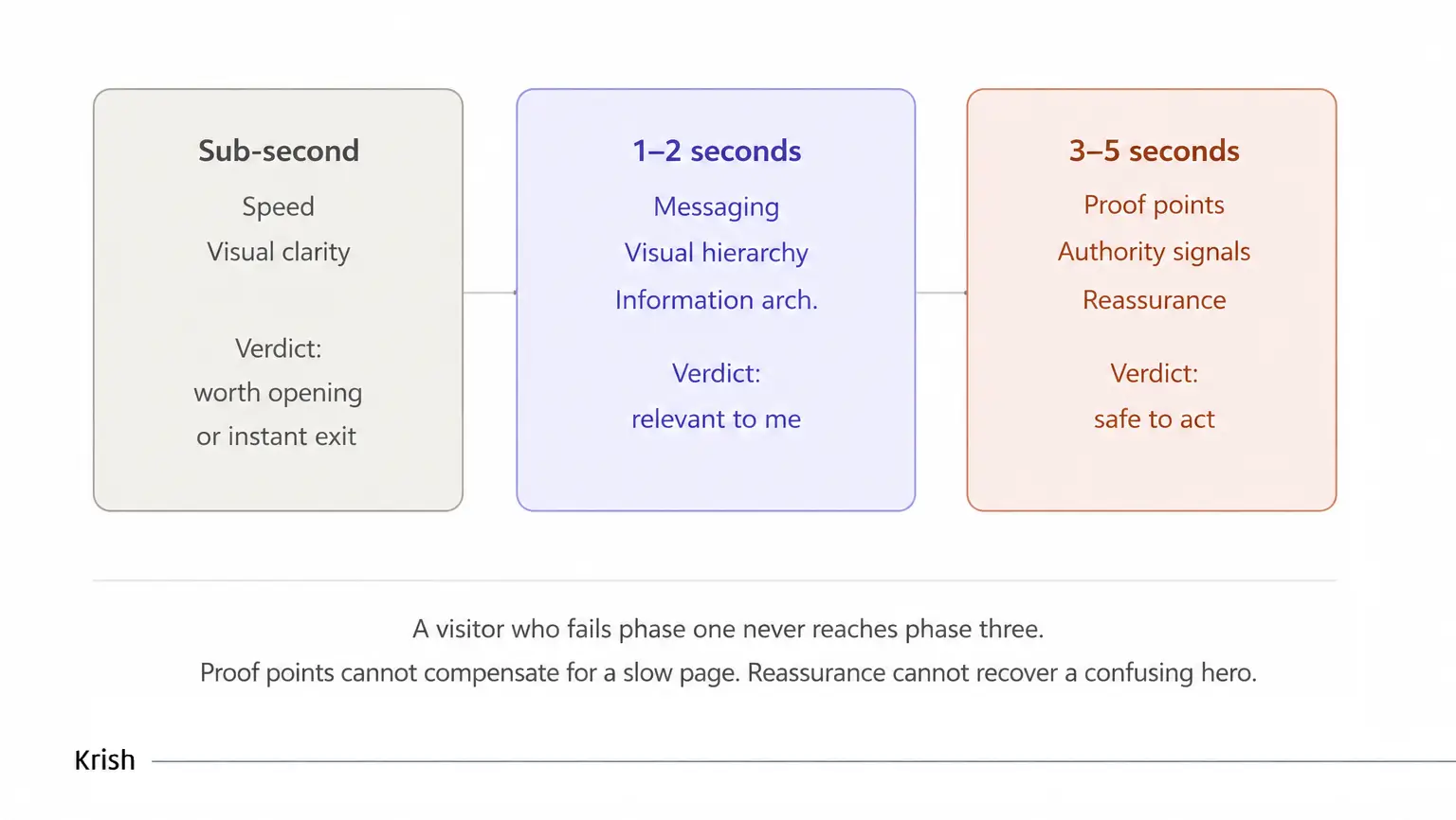
The Trust Formation Sequence
Trust in the first five seconds is not one moment. It is three sequential verdicts, each gating the next. Each phase is a gate. What follows covers every signal in each phase, anchored in documented brand decisions that prove the point.
Phase One: Speed and Visual Clarity
Before a visitor reads a headline, two signals have already fired and rendered a verdict.
Speed is not a performance metric. It is a trust signal.
Google and Deloitte’s “Milliseconds Make Millions” study analyzed 30 million user sessions across 37 brands over four weeks. The findings are specific:
- A 0.1-second improvement in mobile page load time increased retail conversion by 8.4%
- The same improvement increased lead generation form completions by 21.6%
- eBay’s own published data from the same period found every 100ms improvement in load speed increased add-to-cart counts by 0.5%
A slow page does not just frustrate visitors. It signals, before a single element is visible, that the organization behind it cannot be trusted to deliver a competent experience. The trust deficit begins before the page exists.
Visual clarity is the first credibility test every visitor runs.
The Stanford Web Credibility study‘s finding that 46.1% of users judge credibility based on visual design alone places it above all other trust factors. A cluttered above-the-fold, inconsistent typefaces, or a hero section that doesn’t immediately communicate purpose, triggers a credibility failure before reading begins. Not a skeptical one, but a subconscious one.
What breaks visual clarity instantly:
- Competing elements at equal visual weight above the fold
- Typeface inconsistency signaling a page assembled rather than designed
- A hero section answering a question nobody arrived with
Case study – Gymshark: speed and clarity solved at the most trust-critical moment
Gymshark rebuilt its mobile checkout architecture around the specific trust doubts that peak at the payment stage. Rather than adapting a desktop flow:
- Express payment options appear at the top, letting shoppers skip the form entirely by using Apple Pay or Google Pay, transferring existing trust in a payment platform directly to the transaction
- A single-column layout eliminates orientation cost on a small screen
- The CTA stays fixed at the bottom throughout, always visible, never requiring a hunt
- Real-time field validation flags errors as the user types, not after submission, removing the jarring distrust of a failed checkout attempt
No redesign or a new brand language. Every decision answered a phase-one doubt at the exact moment it formed.
Phase Two: Messaging, Hierarchy, and Information Architecture
Between one and two seconds, the visitor reads the hero and decides whether this page is for them.
Messaging: the question your headline must answer before anything else.
Cover everything on your page except the hero headline. Can a first-time visitor tell what you do, for whom, and what changes for them, in one read?
If the subheading carries the core message, the headline has already failed. The subheading adds depth. The headline earns the second line. A headline that reads “We help businesses grow” has answered no question any visitor has arrived with.
Visual hierarchy: the page should guide, not present.
When three CTAs appear at equal visual weight, feature descriptions match the headline in size, and trust signals are positioned for aesthetic balance, the visitor has to do work the page should have done for them. Visual hierarchy is not a design preference. It is the sequencing of elements by commercial importance; the page tells the visitor where to look, in what order, toward what decision.
Information architecture: visitors arrive with questions, not categories.
When navigation and page structure reflect internal product logic rather than the questions visitors arrive with, every new visitor has to translate. They did not come thinking in your taxonomy. They came with a need. The architecture either meets that need or forces them to hunt, and as Krish’s conversion funnel analysis documents: when paid social traffic exits the same landing page at twice the rate of organic traffic, the cause is almost always an architecture that assumed knowledge the visitor didn’t have.
Case study – Warby Parker: when the entire phase-two problem was category-level
In 2010, buying prescription glasses online without trying them on was not something consumers did. The category didn’t exist. No headline could resolve the central doubt: what if they don’t fit my face?
No trust badge answered that. No review answered it. The only correct phase-two answer that Warby Parker applied was physical: order five frames, try them at home for five days, return what you don’t want at no cost.
The Home Try-On program launched and:
- The Warby Parker website crashed on launch day from volume
- Their top 15 styles sold out within four weeks
- They built a 20,000-person waitlist within weeks of launch
The hero section that communicated the program clearly resolved the most important messaging question in the category before any other signal needed to do work. Phase two was won before the visitor reached phase three.
Phase Three: Proof, Authority, and Reassurance
Between three and five seconds, the visitor who passed phases one and two arrives at the final question: is this safe enough to act on?
Proof points: the pattern-match that replaces independent evaluation.
A review that says “great product” answers no fear. A review that says “we reduced checkout abandonment by 28% in Q3 after implementing this” triggers the pattern match that converts: someone like me did this; it worked.
What makes proof work at this phase:
- Reviews naming specific, verifiable outcomes, not generic satisfaction
- For B2B: named case studies from companies in the same vertical as the buyer – the closer the match, the lower the remaining doubt
- Volume signals that show legitimacy: a product with 847 reviews communicates something a product with 3 reviews cannot, regardless of the star rating
Authority: the cognitive shortcut that replaces verification.
When a trusted source vouches for an offer, the visitor stops independently verifying it. The failure mode is almost always placement. A press logo in the footer, three scrolls from the decision, does none of this work. The same logo placed immediately below the hero, before doubt has formed, does it precisely where it is needed.
Reassurance: the final barrier before the click.
A visitor who has understood the offer and found evidence that it works still has one remaining hesitation: the cost of being wrong. Free trials, no-contract terms, visible refund policies: each removes a specific category of risk. None of them work buried in a linked policy page. All of them work placed adjacent to the action they are meant to enable.
Warby Parker’s phase-three architecture:
Phase two removed the fit risk through the Home Try-On program. Phase three removed the financial risk through:
- A one-year no-scratch guarantee stated beside the purchase action
- Free shipping and hassle-free returns positioned at the commitment point, not in a policy page
- An SSL badge and PCI compliance icon placed directly beside the card number field at checkout – not in a header, not in a footer, at the specific field where payment anxiety peaks
Case study – Amazon: when the most powerful reassurance signal in ecommerce became obsolete
Amazon Prime’s “try before you buy” program allowed members to order up to six clothing items, shoes, and accessories, keep them for seven days, and return anything unwanted before being charged. No upfront payment. No friction at the commitment moment. A direct, structural answer to the most specific fear in fashion ecommerce: buying something for your body without trying it on first.
It was, for the period it ran, one of the most conversion-engineered reassurance signals in retail. The program removed financial risk entirely at the point of highest hesitation, not with a badge, not with a guarantee statement, but with a physical mechanism that made the risk genuinely disappear.
Amazon discontinued it in January 2025, as reported by Modern Retail. The reason: virtual try-on technology had advanced to the point where the underlying fear, will this fit and look right on me, was answerable digitally, and 300+ Warby Parker stores meant most try-on users lived within 30 minutes of a location where they could walk in.
The program did not fail. The fear it was built to answer became solvable by cheaper means.
What Amazon’s decision proves about phase-three trust signals:
- The signal only works if it answers a real, specific fear that exists at the moment of commitment
- When the underlying fear changes, the signal must change with it
- A trust program built around removing a fear that technology has already removed is cost without return
The lesson for any reassurance architecture: start with the fear, not the signal. The program that removes a real, specific hesitation at the exact moment it peaks will always outperform a generic guarantee placed somewhere on the page. When the fear shifts, the signal shifts. Amazon’s try-on program was not discontinued because reassurance stopped mattering. It was discontinued because a better, cheaper answer to the same fear had arrived.
The Diagnostic
All these signals operate in a specific sequence. Misplace any one of them, and it answers a doubt that isn’t live yet, or fails to reach the visitor before a doubt they had already acted on.
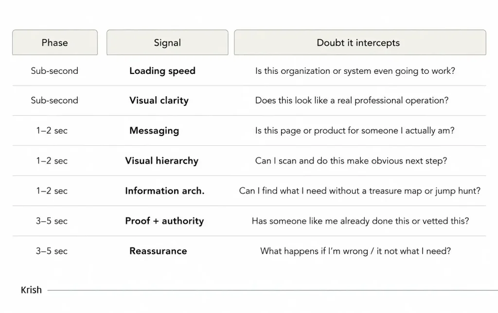
The diagnostic question before any experimentation is not “do we have these signals” but “does each signal sit at the phase where its specific doubt is active.” A guarantee in the footer answers a fear the visitor acted on two scrolls earlier. A security badge in the header answers a payment doubt before any payment is in sight.
Gymshark, Warby Parker, and Amazon each built precisely timed trust architectures, not more trusted brands. The signals matched the doubts. The placement matched the phase. The conversion rate followed.
This is the standard Krish’s CRO audit practice applies before any experimentation: map each trust element against the specific doubt it resolves and the phase at which that doubt is live. Every mismatch is a trust gap, regardless of how many signals the page already contains. Issue 09: Why Most A/B Testing Programs Fail, which tests these placements systematically and attributes revenue to each one.
Table of Content
Subscribe with Us!
Never miss any post, stay tuned!

Minal Joshi is a content marketer at Krish with a flair for eCommerce and Digital Commerce aspects. She is a MarTech fanatic with a knack of writing with which, she helps brands to curate, create, & commence digital brand positioning. Sharing insights via articles, case studies, eBooks, Infographics, and other forms of content creation is what she lives for. Being an ardent traveler, when not writing, you'll find her sipping coffee into the mountains or petting a stray.
Recommended Reading:
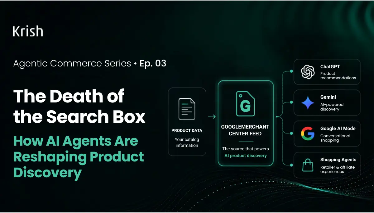
The Death of the Search Box: How AI Agents Are Reshaping Product Discovery
16 July, 2026
How Product Discovery is Changing in 2026
Your Google Merchant Center feed is already powering ChatGPT's product recommendations. Most brands have no idea. In November 2025, researchers at Peec AI found base64-encoded Google Shopping parameters buried inside ChatGPT's source code. They decoded the field, reconstructed the Google Shopping URLs, and confirmed what the industry had long suspected but never proven at scale: ChatGPT is not building product carousels from scratch. It is pulling directly from Google's organic Shopping results.Subscribe with Us!
Never miss any post, stay tuned!
Trusted by leading brands


