
The Inside-out Problem
Good UX is not the absence of bad design. It is the presence of decisions made from the visitor’s side of the screen, not the team’s.
Most ecommerce sites are built from the inside out: the information architecture reflects how the business thinks about its products. The navigation reflects how the catalog is organized internally, the checkout reflects what the CRM team needed to capture, and the CTA placement reflects where the design grid had room. Each decision had a rationale. None of them were made by someone actually trying to buy.
The result is a site that works perfectly for the people who built it and creates friction for everyone else. Not dramatic, but visible friction. The kind that Baymard Institute’s 200,000+ hours of usability research describes as the primary cause of conversion loss on professionally designed, heavily invested ecommerce properties: 64% of leading US and European sites perform “mediocre” or worse on checkout UX alone, per Baymard’s checkout usability benchmark. Not despite professional design investment, but alongside it.
Issue 06 established where the line sits between design quality and conversion effectiveness. This issue is what stands on that line in practice: 7 specific UX patterns, each built from reasonable decisions, each documented in primary research, and each costing conversions on sites that passed every internal review.
The 7 UX Mistakes Reducing Your Conversion Rate
Most ecommerce UX problems are not obscure. They are structural, predictable, and documented in thousands of usability test sessions. Here is a practitioner’s checklist of 7 specific UX patterns, each costing conversions daily on sites that look and feel considered.
1. Hidden CTAs
The action you want visitors to take should never require them to go looking for it.
The average US ecommerce checkout flow contains 23.48 default form elements, per Baymard’s UX statistics. But the problem starts earlier, on pages where the CTA itself is buried beneath brand content, specifications, or lifestyle imagery that the design system elevated above the decision.
HubSpot’s analysis of 330,000 CTAs found that personalized CTAs convert 202% better than generic ones. The relevance of that finding for placement: if the right CTA at the right moment lifts performance by that magnitude, the wrong CTA in the wrong position simply does not convert at all.
Real cases show what fixes this specifically:
- B2B platform TrustRadius doubled CTA click-through rates by changing from a banner CTA, which users scrolled past before reaching, to a sticky button that remained visible throughout the page
- Video platform Willo increased conversions by over 50% by reducing their homepage from multiple CTAs to a single visible option, book a demo, and removing the visual competition between actions
What this looks like as a diagnostic: on your highest-traffic product or service page, scroll to the 50% depth mark. Is the primary CTA visible without scrolling back up? If not, that is a confirmed placement problem, not a hypothesis.
2. Overwhelming navigation
Navigation that shows everything helps nobody find anything.
Baymard’s 2025 Homepage and Navigation benchmark, drawing on 16,000+ manually reviewed UX performance scores across 180+ leading sites, found that up to 67% of leading US and European ecommerce sites perform “mediocre” to “poor” on navigation UX, per Baymard’s navigation research.
The specific failures in their usability testing documents are precise:
- 95% of sites fail to highlight where a visitor currently is within the navigation hierarchy, creating orientation loss that forces users to either start again or exit
- Navigation headings are non-clickable static text on many sites, despite the majority of test participants expecting them to be clickable parent categories and attempting to click them
- 51% of sites fail to visually distinguish clickable elements clearly from non-clickable ones, creating broken expectations at every navigation interaction
The commercial consequence: a visitor who cannot orient themselves within your navigation cannot find the product they came for. They do not try indefinitely. They exit.
The diagnostic question: open your own site as if it’s your first visit. From the homepage, navigate to a specific subcategory using only the navigation. Count the steps, the dead ends, and the moments where you weren’t certain what was clickable. Each of those moments is a documented exit point in Baymard’s testing.
For the audit structure, the ecommerce audit mistakes guide covers navigation as a primary conversion leak requiring systematic review before any other page-level optimization.
3. Inconsistent messaging
A visitor who notices a gap between what an ad promised and what the page delivers has already started distrusting you.
Message match, the alignment between what a visitor was shown before the click and what they find on arrival, is one of the least measured variables in most CRO programs. Yet from Krish’s funnel drop-off analysis work, entry-page exit rate segmented by traffic source is one of the most reliable signals of a message mismatch problem: when paid social traffic exits the same landing page at twice the rate of organic traffic, the page is not the primary issue.
The specific forms this takes in practice:
- A paid search ad leads with a specific product benefit; the landing page opens with a generic brand headline requiring the visitor to re-establish what they came for
- An email promotion references a discount; the linked page shows a full-price product with the offer buried in a banner the visitor has to scan for
- A retargeting ad shows a product the visitor previously viewed; the click leads to a category page rather than that product
Each case imposes cognitive work on the visitor that the journey was supposed to have already done. When that work is not done, the visitor’s first task becomes reconciling the inconsistency, not evaluating the offer. Attention spent on reconciliation is attention not spent on converting.
Hubstaff, a workforce management platform, tested a new homepage design featuring a revamped navigation, a stronger lead message, and updated social proof alongside their existing brand imagery. The hero form submission conversion rate rose 34%. The single biggest variable: the message entering from the ad and the message at the hero were now consistent, removing the first question a new visitor had to answer.
4. Weak visual hierarchy
If everything is prominent, nothing is. The visitor’s eye goes everywhere and stops nowhere.
Visual hierarchy is the sequencing of page elements by commercial importance: guiding a visitor’s attention through the information they need, in the order they need it, toward a decision. When hierarchy is weak, all elements compete simultaneously and the visitor defaults to a rapid scan that frequently misses the CTA entirely.
The diagnostic patterns are observable without any tooling:
- Three or more CTAs visible in the same viewport at equal visual weight
- Headline, product title, price, reviews, and description all displayed at similar font sizes with no clear reading priority
- Trust signals, promotional banners, and social proof widgets sitting at the same visual priority as the primary action
- Lifestyle imagery competing with specification copy rather than contextualizing it
Weak hierarchy is not the same as poor design. Pages with weak hierarchy are often visually rich and well-produced. The problem is that “visually rich” and “decision-oriented” are different objectives that produce different page structures, a distinction Issue 06 of this series covered with specific research.
The heatmap evidence surfaces this clearly: if click heatmaps show visitor attention distributed relatively evenly across the page rather than concentrated on the primary CTA, hierarchy is failing. The CTA is visible. It is not receiving disproportionate visual weight.
5. Long forms
Every unnecessary form field is a tax on visitor patience. The account has a finite balance.
Baymard’s UX statistics, drawn from their full research library, establish a specific benchmark: an ideal checkout flow can be as short as 12 to 14 form elements. The average US ecommerce checkout contains 23.48. Their testing shows that most sites can achieve a 20-60% reduction in default form fields without losing any necessary transaction data.
The specific field-level findings from Baymard’s checkout research are operational:
- 18% of users abandon checkout because the process is too long or complex
- 14% abandon when a phone number field is required without explanation of why, yet 39% of ecommerce sites require it with no context
- Only 14% of checkout flows explicitly distinguish required fields from optional ones, leaving the majority of visitors to guess what they must complete
- 63% of mobile sites don’t use the correct keyboard type for one or more form fields, creating avoidable friction on numeric inputs like card numbers and postcodes
The “Address Line 2” field is a documented specific failure: Baymard’s testing shows participants stopping, puzzling over whether they need to complete it, and in some cases abandoning the form because they don’t know whether it’s mandatory. The fix requires no redesign: hide it behind an “Add apartment/suite” reveal link, and it disappears from the form visually while remaining accessible.
For a structured audit of form field reduction opportunities, Krish’s CRO audit guide covers form friction as a first-pass intervention with measurable, immediate impact.
6. Poor mobile journeys
Mobile traffic is the majority. Mobile conversion is consistently the minority.
The mobile paradox is one of the most precisely documented patterns in ecommerce conversion research. Baymard’s data: 80% of all internet users own a smartphone, and mobile now accounts for more than half of global web traffic. Dynamic Yield’s benchmarks cited in our conversion funnel analysis quantify the gap specifically: mobile add-to-cart rates run at 6.18% to 6.40%, higher than desktop. Mobile conversion-to-purchase sits at 1.8%, less than half of desktop’s 3.9%.
Intent is present. The downstream experience fails it.
Baymard’s 2025 Mobile UX Trends benchmark, covering 52,000+ usability scores across 150+ leading ecommerce sites, found that the Mobile Main Navigation is the single weakest topic in the entire mobile benchmark, with 69% of sites performing “mediocre” or worse, and no sites achieving a “good” or “perfect” rating, per Baymard’s mobile research. Specific findings:
- 95% of mobile sites fail to highlight the visitor’s current scope in the navigation, producing the same orientation loss that occurs on desktop but with less visible fallback
- 63% of mobile sites trigger the wrong keyboard type for one or more form fields
- 42% of mobile sites don’t provide a “view all” option at each level of the product catalog
- 75% of sites still don’t correctly implement product subtype filters, forcing mobile visitors to browse across mixed-category results with no way to refine within the current context
The mobile experience for most ecommerce sites is a scaled-down version of a desktop experience, not a design built for thumb interaction, cellular bandwidth constraints, and single-viewport decision-making. The conversion gap between mobile intent and mobile purchase is the price of that scaling decision.
7. Cluttered interfaces
Clutter is not the presence of too many elements. It’s the presence of elements that don’t earn their place.
Baymard’s statistics are direct: only 1% of users say ecommerce websites meet their expectations on every visit. 88% of online consumers report being less likely to return to a site after a bad experience, per Baymard’s UX statistics. Cluttered interfaces are a primary driver of both failure modes: they degrade the visit experience and they degrade the likelihood of return.
The most commercially costly clutter patterns:
- Social sharing buttons on product pages with zero visible share counts, which function as documented negative social proof rather than neutral decoration, as Baymard’s research confirms: the absence of engagement evidence actively suppresses confidence
- Cross-sell and upsell modules on the cart page that compete directly with the single action the page exists to enable, confirmed through Baymard’s checkout guidance: “Remove mid-flow cross-sells, newsletter pop-ups, and forced account creation that break the user’s momentum”
- Promotional banners that remain visible throughout checkout, redirecting attention from a task the visitor was actively completing
- Multiple trust signal types stacked in the same region at equal visual weight, creating competition where each element should be reinforcing the decision to proceed
The rage click data surfaces clutter in its most measurable form: visitors clicking on non-interactive promotional content, decorative elements, or visual elements that look actionable and aren’t. Each rage click cluster is documented evidence of an element that is consuming attention; it wasn’t designed to convert. Our DIY CRO Audit Checklist offers a conversion diagnostic that works through 28 checks across four zones, each one targeting a layer of the funnel where revenue loss is predictable, measurable, and recoverable without a full rebuild.
Where to Start
Each mistake is independently identifiable and independently fixable. The sequence below prioritizes by commercial impact and diagnostic speed:
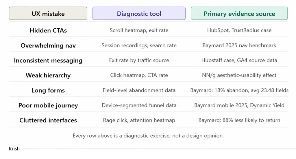
The seven patterns in this issue share a common origin: they were all built by teams that optimized for internal logic rather than the visitor experience. Fixing them does not require a new design language or a platform migration. It requires the discipline of reading behavioral data before drawing conclusions, running tests before shipping changes, and treating every element on every page as a hypothesis about what a visitor needs, not a decision that’s already been made.
That discipline is what separates CRO programs that compound from ones that stall.
Next up, we will cover how the highest-converting brands establish trust before a visitor has read a single line of copy, and why 5 seconds is both the window you have and the one most sites waste entirely.
Table of Content
Subscribe with Us!
Never miss any post, stay tuned!

As Director - Marketing, Zenul leads the marketing and branding at Krish. He brings with him an in-depth understanding of the evolving digital ecosystem and has a proven expertise and experience in strategic planning, market and competition analysis, creating and implementing client-centered, lead-gen and brand marketing campaigns. He has a heart for technology innovation and has been a keynote speaker on various platforms.
Recommended Reading:

From Test Results to Business Impact: The Attribution Challenge – MarTech Masterclass Series Ep | 18
2 July, 2026 A variant reaches statistical significance. The team celebrates, ships the winner, and moves on to the next experiment. Weeks later, the metrics leadership actually tracks have not moved. Revenue per session is flat. The number the finance team questions every quarter shows no change that can be credited to the test. The experiment was run correctly. The result was real. And somehow, nothing changed.
Subscribe with Us!
Never miss any post, stay tuned!
Trusted by leading brands


