Your Shopify Store Probably Doesn't Have a Traffic Problem
Most ecommerce teams diagnose Shopify revenue optimization problems incorrectly.
When revenue slows, the default reaction is predictable:
- Increase ad spend
- Launch another campaign
- Invest in SEO
- Add more channels
- Generate more traffic
More visitors become the solution to every problem. But what if traffic isn’t the problem?
Imagine filling a bucket with water. Every day, your marketing team pours more water into the bucket. Paid ads. Email campaigns. Organic search. Social media. Influencer partnerships.
Traffic increases. Marketing costs increase. Revenue grows but not nearly as quickly as expected.
Then someone notices something obvious. The bucket has dozens of holes in it.
This is what happens in most Shopify stores.
After analyzing hundreds of ecommerce customer journeys, one pattern consistently emerges: brands obsess over traffic acquisition while ignoring the Shopify conversion killers quietly draining revenue from their websites.
- A slow-loading page.
- A confusing product description.
- Hidden shipping costs.
- Weak trust signals.
- Mobile friction.
Individually, these issues seem small.
Collectively, they can cost a Shopify business hundreds of thousands, or even millions, of dollars in lost revenue every year.
The highest-performing Shopify brands and Shopify Plus CRO stores don’t necessarily have more visitors than their competitors.
They simply leak less revenue.
This article reveals the 50 most common Shopify conversion killers discovered during Shopify CRO Audits and explains how to systematically identify and eliminate them.
Why Most CRO Advice Misses the Bigger Opportunity
The ecommerce industry loves conversion rates. Every dashboard, report, and optimization initiative revolves around increasing them. But conversion rate is merely a symptom. The real challenge is revenue leakage.
A revenue leak is any point in the Shopify customer journey optimization where confidence decreases, friction increases, or purchase intent weakens.
Revenue leaks exist everywhere:
- Homepage
- Navigation
- Collection pages
- Product pages
- Search
- Cart
- Checkout
- Mobile experiences
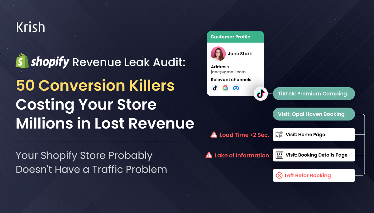
Customers rarely abandon because of one major problem. They abandon because of dozens of small uncertainties. Every uncertainty becomes a leak. Every leak compounds.
The purpose of a Shopify CRO Audit isn’t to persuade people into buying. It’s to remove unnecessary obstacles preventing them from buying.
The Shopify Revenue Leak Framework
Think of your store as a pipeline.
Traffic enters from multiple sources. Only a fraction becomes revenue. At every stage of the Shopify customer journey optimization customer journey, some visitors leave. The goal isn’t perfection. The goal is reducing leakage.
The framework consists of six critical stages:
- Homepage Experience
- Collection Page Experience
- Product Page Experience
- Cart Experience
- Checkout Experience
- Mobile Experience
Let’s start where most customer journeys begin.
Homepage Revenue Leaks (1–8)
Your homepage has one job: Help visitors answer a simple question.
“Am I in the right place?”
The best homepages answer this within seconds. The worst homepages create confusion. And confusion is expensive.
Revenue Leak #1: Unclear Value Proposition
Many Shopify homepages attempt to communicate everything. As a result, they communicate nothing.
Visitors should immediately understand:
- What you sell
- Who it’s for
- Why it’s different
Weak messaging:
“Welcome to our store.”
Strong messaging:
“Performance apparel engineered for athletes who train every day.”
Specificity reduces uncertainty. Generic messaging increases it. If visitors need to scroll before understanding what your business offers, you’re already leaking revenue.
Expert Insight
Customers don’t buy products first, they buy relevance first. Before evaluating your offer, they need confidence they’re in the right place.
Revenue Leak #2: Slow Hero Sections
Many ecommerce brands fall in love with visual design. Large videos. High-resolution imagery. Complex animations. Beautiful websites. Poor performance.
Unfortunately, customers can’t convert on content that hasn’t been loaded.
Multiple studies have demonstrated a direct relationship between page speed and conversion performance. A delay of even a few seconds can significantly reduce engagement and purchasing behavior.
Ask yourself: Would you rather impress visitors or convert them?
The highest-performing stores prioritize both but conversion always comes first.
Revenue Leak #3: Weak Trust Signals
Trust is the foundation of ecommerce. Unlike physical stores, customers cannot touch products, speak to employees, or inspect quality in person. Trust must be established digitally.
Strong trust signals include:
- Verified customer reviews
- Media mentions
- Industry awards
- Security certifications
- Money-back guarantees
- Customer counts
- User-generated content
Trust signals reduce perceived risk.Reduced risk increases conversion.
The absence of trust signals creates doubt.
Doubt leaks revenue.
Revenue Leak #4: Navigation Overload
More choices don’t always create better experiences. In many cases, they create paralysis.
We’ve audited stores with:
- 20+ top-level navigation items
- Multiple dropdown layers
- Dozens of categories
- Complicated naming conventions
The result?
Visitors spend more time figuring out where to click than actually shopping.
- Effective navigation should guide.
- Not overwhelm.
- Every additional decision creates cognitive load.
- Every unnecessary decision creates friction.
Revenue Leak #5: Banner Blindness
Promotional banners have become the digital equivalent of roadside billboards and consumers have trained themselves to ignore them.
Many stores stack multiple banners above the fold:
- Summer Sale
- Free Shipping
- Loyalty Program
- App Download
- Newsletter Signup
Instead of communicating value, the homepage becomes visual noise.
“Does this help a customer move closer to a purchase?”
If not, it’s probably contributing to revenue leakage.
Revenue Leak #6: Missing Social Proof
People trust other customers more than brands.
This isn’t a criticism, it’s human nature.
Customers want reassurance; they want evidence. They want confirmation that others have purchased and had positive experiences.
Social proof can include:
- Reviews
- Ratings
- Customer photos
- Video testimonials
- Community content
- Purchase counts
The strongest Shopify stores don’t isolate social proof in one section, they integrate it throughout the Shopify customer journey optimization.
Revenue Leak #7: Poor Mobile Experience Shopify Mobile Conversion Optimization
Many ecommerce teams still design for desktop.
Most customers shop on mobile.
This disconnect creates one of the largest revenue leaks in modern ecommerce.
Common mobile issues include:
- Tiny tap targets
- Hidden navigation
- Difficult scrolling
- Slow page speed
- Intrusive popups
Mobile traffic often represents more than 70% of store visitors.
If your mobile experience is poor, most of your traffic is encountering friction before they even view a product.
Revenue Leak #8: No Personalization
Modern consumers expect relevance, yet many Shopify stores present identical experiences to every visitor.
A first-time visitor shouldn’t necessarily see the same homepage as a returning customer. Someone who previously purchased running shoes should not receive generic recommendations.
Personalization accelerates discovery.
Faster discovery increases conversion.
Even basic personalization can significantly reduce revenue leakage.
Collection Page Revenue Leaks (9–15)
Collection pages are among the most underestimated assets in ecommerce.
Many brands invest heavily in homepages and product pages while neglecting the pages where customers actually browse.
Collection pages aren’t catalogs, they’re decision-making environments.
Their job is helping customers find the right product quickly and every obstacle increases abandonment risk.
Revenue Leak #9: Weak Filtering Options
Imagine entering a store with 1,000 products and no way to narrow your choices. That’s exactly what weak filtering feels like.
Customers expect filters for:
- Size
- Color
- Price
- Availability
- Brand
- Product type
When filtering is limited or poorly implemented, shoppers leave instead of continuing their search.
The easier products are to discover, the easier they are to purchase.
Revenue Leak #10: Poor Sorting Logic
Sorting directly influences product discovery.
Many stores default to sorting methods that prioritize internal preferences rather than customer needs.
Customers frequently want:
- Best Sellers
- New Arrivals
- Top Rated
- Price Low to High
- Price High to Low
When relevant products remain hidden, conversion opportunities disappear.
Revenue Leak #11: No Inventory Visibility
Nothing frustrates customers more than discovering a product is unavailable after investing time exploring it.
Inventory transparency matters. Availability indicators help customers make faster decisions. They also create urgency when inventory is limited.
Hiding stock information often creates more frustration than anticipation.
Revenue Leak #12: Product Overload
More products don’t automatically create more sales.
In many cases, they create more confusion. When shoppers face hundreds of options without guidance, decision fatigue takes over. Research in consumer psychology consistently demonstrates that excessive choice can reduce decision-making effectiveness.
They don’t overwhelm.
Revenue Leak #13: Inconsistent Product Imagery
Collection pages rely heavily on visual scanning.
Customers make rapid judgments before reading product names.
When product imagery varies significantly in:
- Lighting
- Background
- Cropping
- Styling
- Quality
The shopping experience feels inconsistent.
Consistency builds professionalism.
Professionalism builds trust.
Trust drives conversion.
Revenue Leak #14: Missing Quick View Functionality
Every click introduces friction.
Quick-view functionality helps customers evaluate products without repeatedly leaving collection pages.
Benefits include:
- Faster browsing
- Reduced interruptions
- Increased product exploration
- Improved user experience
While not appropriate for every store, many catalogs benefit significantly from reducing navigation friction.
Revenue Leak #15: Lack of Merchandising Strategy
Collection pages should function like expertly designed retail shelves.
Unfortunately, many stores organize products randomly.
Top-performing ecommerce brands strategically position products based on:
- Popularity
- Profitability
- Inventory levels
- Seasonality
- Customer demand
Merchandising influences customer behavior, ignoring it means leaving revenue to chance.
A Quick Reality Check
By this point, we’ve identified fifteen potential revenue leaks.
None of them are dramatic.
None require rebuilding your Shopify store.
Yet collectively, these issues can significantly impact Shopify Conversion Rate Optimization, average order value, and overall profitability.
And we’ve barely reached the product page.
The next section examines where the majority of purchase decisions are ultimately won or lost: the product experience itself.
Product Page Revenue Leaks (16–30)
If your homepage attracts visitors and collection pages help them discover products, product pages determine whether they buy.
This is where customers ask themselves critical questions:
- Is this product right for me?
- Can I trust this brand?
- Is the value worth the price?
- What could go wrong if I buy this?
Every unanswered question becomes a revenue leak.
The best product pages don’t simply describe products, they systematically eliminate uncertainty.
Revenue Leak #16: Weak Product Photography
In physical retail, customers pick products up. However, digital commerce, photography has become the substitute.
Poor imagery creates doubt.
High-quality imagery builds confidence.
Every product page should include:
- Multiple viewing angles
- Zoom functionality
- Detailed close-ups
- Contextual usage images
The more clearly customers can visualize ownership, the more likely they are to purchase.
Revenue Leak #17: Missing Lifestyle Photography
Lifestyle photography sells outcomes.
Customers rarely buy a watch because it tells time.
They buy confidence. Status. Identity. Aspiration.
Similarly, customers don’t buy a sofa because it has fabric upholstery. They buy comfort, aesthetics, and the feeling of a beautifully designed home.
Lifestyle imagery helps customers imagine themselves with the product. And imagination drives conversion.
Revenue Leak #18: Generic Product Descriptions
Many ecommerce stores describe products like technical manuals.
They focus on specifications while ignoring customer motivations.
Weak description:
“100% Cotton T-Shirt”
Better description:
“Made from premium breathable cotton designed for all-day comfort, whether you’re working remotely, traveling, or spending weekends outdoors.”
Specifications inform. Benefits persuade.
The strongest product descriptions connect features to outcomes.
Revenue Leak #19: Missing Product Videos
Video reduces uncertainty faster than almost any other content format.
Customers want to see:
- Movement
- Scale
- Texture
- Functionality
- Fit
For many categories, video significantly improves confidence because it simulates an in-store experience.
A customer who understands how a product works is far more likely to purchase it.
Revenue Leak #20: Weak Reviews Strategy
Many brands have reviews, few leverage them effectively.
Reviews should not merely exist but they should answer customer objections.
Strong review implementations highlight:
- Product quality
- Fit and sizing
- Ease of use
- Delivery experience
- Customer satisfaction
The most persuasive reviews sound like customers helping other customers make decisions.
Revenue Leak #21: Missing User-Generated Content (UGC)
Consumers increasingly trust customers more than brands.
Professional photography is expected. Authentic customer content is trusted. UGC bridges the gap between marketing claims and real-world experiences.
Examples include:
- Customer photos
- Social media content
- Customer videos
- Community showcases
UGC reduces perceived risk because it demonstrates product usage in realistic situations.
Revenue Leak #22: Poor Size and Fit Guidance
This is one of the most expensive leaks in apparel, footwear, and fashion ecommerce.
Customers frequently hesitate because they fear ordering the wrong size.
Common issues include:
- Generic sizing charts
- Missing measurements
- No fit guidance
- No model sizing references
Every sizing question left unanswered increases abandonment risk.
Revenue Leak #23: Hidden Shipping Information
Many stores make customers search for shipping information, this creates unnecessary friction.
Customers want immediate answers to questions like:
- How much does shipping cost?
- How long will delivery take?
- Is free shipping available?
When information is hidden, uncertainty grows.
Uncertainty kills conversions.
Revenue Leak #24: Weak Return Policies
Customers don’t buy products, they buy confidence.
A clear return policy reduces perceived risk.
Weak policies create hesitation.
Effective return messaging should be:
- Easy to find
- Easy to understand
- Easy to trust
The easier it feels to return a product, the easier it becomes to purchase it.
Revenue Leak #25: No Urgency Signals
Not artificial urgency. Real urgency.
Customers respond to legitimate scarcity because it helps them make decisions.
Examples include:
- Limited inventory
- Seasonal availability
- Sale expiration dates
- Production timelines
When implemented honestly, urgency reduces procrastination.
Without urgency, many purchases become future purchases that never happen.
Revenue Leak #26: No Inventory Visibility
Customers want transparency.
Showing stock levels can:
- Increase urgency
- Reduce uncertainty
- Accelerate decisions
Inventory visibility should be used thoughtfully, but hiding availability often delays action.
Revenue Leak #27: Weak Call-to-Action Placement
The Add to Cart button should never be difficult to find.
Yet many stores unintentionally bury their most important conversion element.
Common mistakes include:
- Poor contrast
- Excessive spacing
- Visual clutter
- Competing actions
The primary action should always be obvious, customers shouldn’t need to search for the next step.
Revenue Leak #28: Mobile CTA Disappears During Scrolling
This issue appears frequently during Shopify CRO Audits.
Customers scroll through:
- Reviews
- Product details
- FAQs
- Shipping information
By the time they’re ready to buy, the Add to Cart button has disappeared.
Sticky mobile CTAs can significantly reduce friction and improve conversion flow.
Revenue Leak #29: Weak Cross-Sell Strategy
Many stores leave money on the table after customers decide to purchase.
Relevant cross-sells increase Average Order Value (AOV) while improving customer outcomes.
Examples:
- Camera → Memory Card
- Laptop → Protective Sleeve
- Running Shoes → Athletic Socks
The key is relevance.
Aggressive upselling creates resistance.
Revenue Leak #30: Missing FAQs
Every unanswered question creates doubt. Every doubt creates leakage.
FAQs address common concerns before they become objections.
Common FAQ topics include:
- Shipping
- Returns
- Warranty
- Product usage
- Compatibility
- Care instructions
The best product pages proactively answer questions customers haven’t asked yet.
The Trust Gap
Most ecommerce teams focus on persuasion and the best ecommerce teams focus on trust.
Every product page contains an invisible gap.
On one side is what the brand knows, on the other side is what the customer believes.
Revenue is lost inside that gap.
Brands know:
- Product quality
- Manufacturing standards
- Customer satisfaction rates
- Product performance
Customers don’t.
The purpose of a product page is to close that gap.
Reviews, videos, UGC, FAQs, guarantees & comparison charts; all of these exist for one reason: To reduce uncertainty.
They remove reasons not to buy.
Cart Revenue Leaks (31–38)
Reaching the cart does not mean the sale is secured. Far from it.
Many customers who add products to cart never complete their purchase.
Why?
Because the cart introduces new friction.
Let’s examine the most common leaks.
Revenue Leak #31: Surprise Shipping Costs of Shopify Cart Abandonment
This remains one of the largest causes of Shopify cart abandonment.
Customers mentally calculate total cost long before reaching checkout.
Unexpected shipping fees feel like a broken promise.
Transparency wins. Surprises lose.
Whenever possible, communicate shipping expectations early.
Revenue Leak #32: Coupon Code Distraction
The coupon field creates an unintended psychological trigger.
Customers who were ready to buy suddenly ask:
“Wait, am I missing a discount?”
Many then leave to search for coupon codes. Some never return.
A simple field can become a significant revenue leak.
Revenue Leak #33: Weak Upsell Experience
Upsells should feel helpful, not opportunistic.
Effective cart upsells:
- Complement the purchase
- Improve outcomes
- Add convenience
Poor upsells feel random and irrelevant.
Customers recognize the difference immediately.
Revenue Leak #34: No Free Shipping Progress Indicator
Free shipping thresholds can increase average order value. But customers need visibility.
Showing progress toward free shipping creates motivation.
Example:
“You’re only $12 away from free shipping.”
This small message often influences purchasing behavior.
Revenue Leak #35: Hidden Delivery Dates
Modern customers expect delivery clarity.
They want answers to:
- When will it arrive?
- Can I receive it before an event?
- Is expedited shipping available?
Unclear timelines create hesitation.
Clear expectations build confidence.
Revenue Leak #36: Forced Account Creation
Customers want convenience.
Forced registration creates friction. Every additional step introduces risk.
Guest checkout options consistently improve checkout completion rates.
Let customers buy first.
Encourage account creation later.
Revenue Leak #37: Slow Cart Performance
Many stores focus on homepage speed while ignoring cart performance.
Slow carts create a dangerous experience because customers are closest to conversion.
Even minor delays can disrupt purchase momentum.
Performance matters throughout the Shopify customer journey optimization, not just at the beginning.
Revenue Leak #38: Mobile Cart Friction
Common mobile cart issues include:
- Difficult quantity updates
- Tiny buttons
- Confusing layouts
- Poor spacing
When customers struggle to interact with the cart, abandonment increases.
Mobile optimization isn’t optional.
It’s foundational.
Checkout Revenue Leaks (39–45)
Checkout is where intent becomes revenue.
At this stage, customers have already chosen:
- The product
- The brand
- The price
The final challenge is making Shopify checkout optimization effortless.
Every unnecessary step becomes a leak.
Revenue Leak #39: Excessive Form Fields Shopify Checkout Optimization
Many checkout forms ask for information that isn’t necessary.
Every additional field increases effort. Every increase in effort reduces completion. Ask only for information required to fulfill the order. Nothing more.
Revenue Leak #40: Limited Payment Options
Customers prefer different payment methods.
Some prefer cards, others prefer digital wallets and others prefer Buy Now Pay Later solutions.
Restricting payment choices restricts conversion opportunities.
Flexibility improves checkout completion.
Revenue Leak #41: Missing Express Checkout
Speed matters, particularly on mobile.
Solutions like:
- Shop Pay
- Apple Pay
- Google Pay
- PayPal Express
allow customers to complete purchases in seconds rather than minutes.
The fewer steps required, the fewer opportunities for abandonment.
Revenue Leak #42: Weak Error Handling
Nothing frustrates customers more than unclear checkout errors.
Bad example:
“Something went wrong.”
Helpful example:
“Please enter a valid postal code.”
Clear guidance helps customers recover quickly and continue purchasing.
Revenue Leak #43: Missing Trust Reinforcement
Trust shouldn’t disappear at checkout.
Customers still evaluate risk.
Checkout pages should reinforce confidence through:
- Security messaging
- Payment protection
- Return policies
- Contact information
Trust is cumulative. Every reassurance helps.
Revenue Leak #44: Poor Mobile Checkout Experience
Many checkout experiences still feel designed for the desktop.
Common problems include:
- Difficult keyboard interactions
- Tiny form fields
- Complex navigation
- Poor autofill support
Mobile users expect simplicity, complexity causes abandonment.
Revenue Leak #45: No Checkout Progress Visibility
Customers like knowing where they are in the process.
Progress indicators reduce uncertainty and create momentum.
Simple steps such as:
Cart → Information → Shipping → Payment
help customers understand what’s left.
Clarity improves completion rates.
By this point in the audit framework, we’ve uncovered 45 potential revenue leaks.
Most are not major redesign projects.
Most are small friction points.
But ecommerce success is rarely determined by one large improvement.
It’s determined by the cumulative impact of dozens of small optimizations.
And nowhere is that more apparent than mobile commerce, where the final five leaks often separate average Shopify stores from high-performing ones.
Mobile Revenue Leaks (46–50)
Mobile commerce is no longer the future, Shopify mobile conversion optimization is the present.
For many Shopify brands, mobile devices generate more than 70% of traffic.
Yet conversion rates on mobile often remain significantly lower than desktop.
Why?
Because many ecommerce experiences are still designed on large screens and merely adapted for smaller ones.
The result is friction and friction creates revenue leaks.
Revenue Leak #46: Tiny Tap Targets
One of the simplest usability issues can also be one of the most expensive.
Buttons, filters, navigation elements, and quantity selectors that are difficult to tap create frustration.
Users should never need to zoom in or repeatedly tap an element to perform a simple action.
Small usability issues compound quickly across the Shopify customer journey optimization.
A customer who becomes frustrated before reaching checkout often abandons altogether.
Revenue Leak #47: Poor Core Web Vitals
Mobile users are less patient than desktop users.
They’re often:
- Multitasking
- Shopping on the move
- Using cellular networks
- Experiencing distractions
A slow experience creates immediate drop-off.
Common causes include:
- Oversized images
- Excessive scripts
- Third-party app bloat
- Unoptimized themes
Many stores install dozens of Shopify apps without considering their performance impact.
Every unnecessary script is another opportunity to lose a customer.
Revenue Leak #48: Sticky Elements Blocking Content
Sticky banners.
Sticky chat widgets.
Sticky promotional bars.
Sticky discount popups.
Individually, each may seem helpful.
Collectively, they often create a frustrating experience.
When users struggle to see product information because multiple elements occupy screen space, conversion suffers.
Protect it carefully.
Revenue Leak #49: Poor Mobile Search Experience
Mobile shoppers frequently rely on search rather than navigation.
A weak search experience creates significant revenue leakage.
Common issues include:
- Irrelevant results
- No autocomplete
- Poor typo tolerance
- Missing product recommendations
When customers can’t find products quickly, they assume the store doesn’t have what they need.
Search isn’t a utility. It’s a revenue-generating feature.
Revenue Leak #50: Difficult Mobile Checkout
The final leak is often the most costly.
Customers who reach checkout have demonstrated strong purchase intent.
Yet many stores still create unnecessary obstacles:
- Multiple screens
- Excessive form fields
- Difficult payment experiences
- Poor autofill support
- Confusing validation messages
The ideal mobile checkout experience feels almost invisible. The fewer the interactions required, the higher the likelihood of conversion.
The Hidden Cost of Revenue Leaks
Most ecommerce discussions focus on increasing traffic.
The assumption is simple:
More visitors equals more revenue. But this approach overlooks a fundamental reality: Traffic acquisition is becoming more expensive every year.
Media costs increase. Competition intensifies. Customer acquisition costs rise.
As a result, many brands find themselves trapped in an endless cycle of spending more simply to maintain growth.
The most profitable ecommerce operators think differently: they focus on Shopify revenue optimization and existing traffic.
Consider two scenarios.
Scenario A: Traffic Growth
Monthly Traffic: 500,000 Visitors
Conversion Rate: 2%
Average Order Value: $100
Monthly Revenue: $1,000,000
To generate an additional $150,000 in revenue, the business invests heavily in acquisition. Resulting in more ads, more campaigns and more spend.
Scenario B: Revenue Leak Reduction
Monthly Traffic: 500,000 Visitors
Conversion Rate: 2.3%
Average Order Value: $100
Monthly Revenue: $1,150,000
Same traffic. Same products. Same brand.
The only difference is reduced friction.
The additional revenue is generated by optimizing existing shopify customer journey optimization rather than purchasing additional traffic.
One strategy requires more budget.
The other creates greater efficiency.
The most mature ecommerce brands prioritize both. But they optimize leakage before scaling acquisition.
Why Small Improvements Create Massive Outcomes
Many CRO initiatives fail because teams expect dramatic results from individual changes. That’s rarely how optimization works.
Revenue growth typically emerges from cumulative gains.
For example:
Homepage Improvements: +3%
Collection Page Improvements: +2%
Product Page Improvements: +5%
Cart Improvements: +4%
Checkout Improvements: +3%
Mobile Improvements: +4%
Individually, these improvements seem modest. Collectively, they can produce transformational outcomes.
This is why the best CRO programs focus on systems rather than isolated experiments.
The goal isn’t finding one silver bullet, the goal is fixing dozens of small leaks.
The Shopify Revenue Recovery Framework
During the Ecommerce CRO Audit, we evaluate opportunities using four categories.
1. Trust Leaks
Examples include:
- Missing reviews
- Weak guarantees
- Lack of UGC
- Poor social proof
Trust leaks increase perceived risk.
2. Friction Leaks
Examples include:
- Slow pages
- Excessive form fields
- Difficult navigation
- Mobile usability issues
Friction increases effort.
3. Clarity Leaks
Examples include:
- Weak messaging
- Confusing CTAs
- Hidden shipping details
- Poor product information
Clarity leaks create uncertainty.
4. Decision Leaks
Examples include:
- Choice overload
- Weak merchandising
- Poor filtering
- Missing urgency
Decision leaks delay action.
The most successful Shopify brands systematically reduce all four categories.
What a High-Performing Shopify Store Looks Like
After auditing hundreds of ecommerce experiences, high-performing stores consistently share common characteristics.
They make buying easy.
Not just possible, easy.
Visitors immediately understand:
- What the brand sells
- Why it matters
- Which products are relevant
- Why they can trust the business
- How to complete a purchase
There are no unnecessary obstacles.
No confusing experiences. No hidden surprises.
Every interaction reduces uncertainty. Every page builds confidence. Every step feels intentional.
This is what exceptional Shopify Conversion Rate Optimization looks like.
Executive Summary: The 50 Shopify Revenue Leaks
Homepage
- Unclear value proposition
- Slow hero sections
- Weak trust signals
- Navigation overload
- Banner blindness
- Missing social proof
- Poor mobile experience
- No personalization
Collection Pages
- Weak filtering
- Poor sorting
- No inventory visibility
- Product overload
- Inconsistent imagery
- Missing quick view
- Weak merchandising
Product Pages
- Weak photography
- Missing lifestyle imagery
- Generic descriptions
- Missing video
- Weak reviews
- Missing UGC
- Poor sizing guidance
- Hidden shipping information
- Weak return policies
- Missing urgency
- No inventory visibility
- Weak CTA placement
- Missing sticky mobile CTA
- Weak cross-sells
- Missing FAQs
Cart
- Surprise shipping costs
- Coupon distractions
- Weak upsells
- No free-shipping progress
- Hidden delivery dates
- Forced account creation
- Slow cart performance
- Mobile cart friction
Checkout
- Excessive form fields
- Limited payment options
- Missing express checkout
- Weak error handling
- Missing trust reinforcement
- Poor mobile checkout
- No progress indicators
Mobile
- Tiny tap targets
- Poor Core Web Vitals
- Sticky element overload
- Weak search experience
- Difficult mobile checkout
Your Next Million Dollars Is Probably Already on Your Website
Most ecommerce brands assume growth comes from:
- More advertising
- More channels
- More campaigns
- More traffic
Sometimes that’s true.
But often, the fastest path to growth is recovering revenue you’re already losing.
Your customers are already visiting your website.
The question is:
How much revenue is leaking from the experience you’ve built?
The brands that answer this question outperform competitors because they focus on efficiency before expansion.
They improve conversion before increasing spend. They optimize journeys before scaling traffic. They recover revenue before chasing more visitors. And over time, those advantages compound.
Get a Shopify Store Audit Revenue Leak Audit
A generic CRO report won’t uncover what a proper Shopify UX audit would reveal.
Effective Shopify Conversion Audits require:
- Customer journey analysis
- Behavioral insights
- Ecommerce expertise
- Shopify-specific knowledge
- Conversion-focused prioritization
Our Shopify CRO specialists evaluate:
✓ Homepage Experience
✓ Collection Pages
✓ Product Pages
✓ Cart Experience
✓ Checkout Journey
✓ Mobile Experience
✓ Conversion Friction
✓ Revenue Opportunities
You’ll receive a prioritized roadmap showing where revenue is leaking and which improvements can generate the highest impact.
No generic recommendations.
No automated scoring.
Just actionable insights tailored to your business.
Final Thought
The most successful Shopify brands don’t win because they have more traffic. They win because they waste less of it.
Every visitor who leaves because of friction, uncertainty, confusion, or distrust represents revenue that was already within reach.
The opportunity isn’t always finding more customers. Often, it’s creating a better experience for the customers you already have.
That’s where sustainable ecommerce growth begins.
Frequently Asked Questions
- Homepage
- Navigation
- Collection pages
- Product pages
- Cart
- Checkout
- Mobile usability
- Site speed
- Customer journey
- Analytics and behavior tracking
Table of Content
- Your Shopify Store Probably Doesn't Have a Traffic Problem
- Why Most CRO Advice Misses the Bigger Opportunity
- The Shopify Revenue Leak Framework
- Homepage Revenue Leaks (1–8)
- Collection Page Revenue Leaks (9–15)
- A Quick Reality Check
- Product Page Revenue Leaks (16–30)
- The Trust Gap
- Cart Revenue Leaks (31–38)
- Checkout Revenue Leaks (39–45)
- Mobile Revenue Leaks (46–50)
- The Hidden Cost of Revenue Leaks
- Why Small Improvements Create Massive Outcomes
- The Shopify Revenue Recovery Framework
- What a High-Performing Shopify Store Looks Like
- Executive Summary: The 50 Shopify Revenue Leaks
- Your Next Million Dollars Is Probably Already on Your Website
- Get a Shopify Store Audit Revenue Leak Audit
- Final Thought
Subscribe with Us!
Never miss any post, stay tuned!
[email-subscribers-form id="1"]As Director - Marketing, Zenul leads the marketing and branding at Krish. He brings with him an in-depth understanding of the evolving digital ecosystem and has a proven expertise and experience in strategic planning, market and competition analysis, creating and implementing client-centered, lead-gen and brand marketing campaigns. He has a heart for technology innovation and has been a keynote speaker on various platforms.
Recommended Reading:
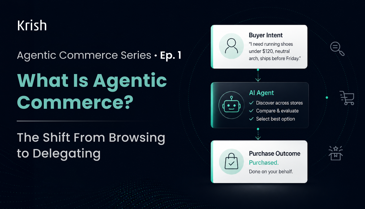
What Is Agentic Commerce? A Practical Guide for Ecommerce Leaders – Agentic Commerce Series | EP 1
22 June, 2026 That agent will research, compare, and buy on their behalf without clicking through your homepage, reading your PDPs, or experiencing your brand the way you designed it to be experienced. And when it is done, it will report back as “purchased”.
Subscribe with Us!
Never miss any post, stay tuned!
[email-subscribers-form id="1"]Trusted by leading brands


