
The Dashboard Confidence Trap
“Dashboard consistency is not equally proportionate to decision clarity.”
Let that sink in. In reality, over the past five years, organizations have invested heavily in analytics platforms, real-time reporting, and executive dashboards.
The result? Abundance of data. Yet multiple large-scale management studies point to the same conclusion: more data has not translated into better decisions.
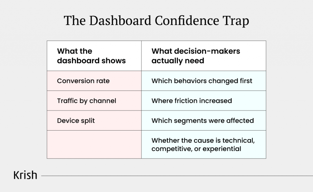
Let’s understand that with a scenario:
You see a dashboard showing 18% drop in mobile conversion rate.
But the real deal is,
- It cannot tell you which behavioral signals changed before the drop?
- Where friction increased in the journey?
- Why specific segments were affected? Or whether
- The issue is technical, competitive, or experiential?
Without behavioral depth, your response is theater. Solutions that one should aim on is, you redesign checkout when the real issue was payment latency for iOS users in specific geographies. You invest in channels that appear efficient in aggregate while missing that performance is driven by a small, unsustainable segment.
Aggregate metrics are the last to know when customer behavior shifts. By the time your dashboard reflects the problem, the opportunity has been lost.
Why This Episode Matters
In the previous MarTech Masterclass episodes, we observed 5 event tracking strategies that turn behavioral signals into business decisions, and with this episode, we understand whether our dashboards are designed to just explain performance or to shape decisions.
Key questions this episode tackles:
- Why do most dashboards get reviewed but not acted upon?
- How does collapsing executive, tactical, and operational views into one layer dilute decision clarity?
- Why do more KPIs often slow decisions instead of sharpening them?
- How can alerts and thresholds shift dashboards from passive views to active decision systems?
Where Decisions Actually Happen Versus Where Dashboards Stop
Dashboards do not fail because they lack information. They fail because information does not create commitment. A survey revealed that approximately 80% of a data scientist’s time is spent simply collecting, cleaning, and organizing data. Only 20% of their time is spent on more creative activities like mining data for patterns, refining algorithms, and building training sets. By the time data becomes decision-ready, the decision window has closed.
Leadership does not wait for clean data. They decide with available information, then retrospectively validate when dashboards catch up. This creates the illusion of data-driven decision-making while actual decisions remain intuition-driven.
The Decision Velocity Gap
McKinsey research examining organizational decision-making found that only 48% of respondents agree that their organizations make decisions quickly, and just 37% say their organizations’ decisions are both high in quality and velocity. The gap between quality and speed exists because dashboard architecture treats decision-making as a single activity rather than recognizing that it operates across fundamentally different layers.
Decision velocity actually varies by organizational layer:
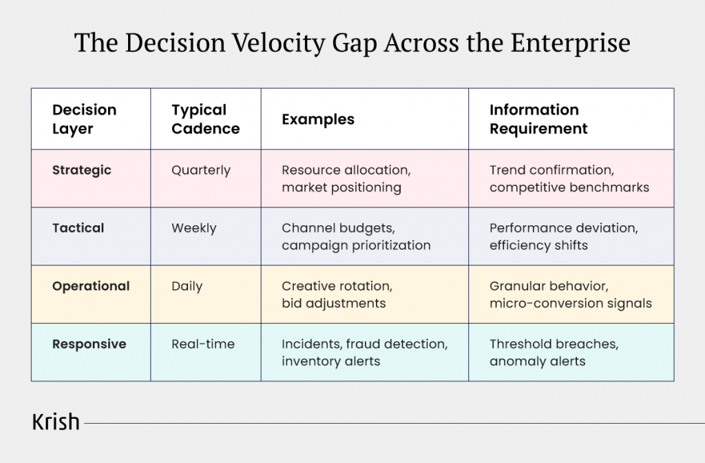
Yet most enterprises serve all decision contexts from a single reporting layer. Management reviewing quarterly trends sees the same metric structure as the performance manager optimizing daily spend.
When Speed Becomes Structural Advantage
Additional McKinsey research on high-velocity decision-making found a critical shift: Many organizations now allocate resources quarterly instead of annually, and some do so even more frequently. Although this means more meetings, companies can move more quickly because there is less guesswork. Faster decision cadence requires signal specificity. Not more metrics. Not faster refresh rates. Different information architectures for different decision altitudes.
The structural question: if decisions operate across fundamentally different layers with distinct velocities, what design principles ensure each layer receives the signals needed to act with conviction rather than hesitation? Let’s find out.
The 3 Decision Layers Every Dashboard Must Serve
Most dashboards fail for a reason that is both obvious and routinely ignored: they try to support every decision with the same information architecture.
In reality, decisions inside an organization operate at fundamentally different altitudes. A board member reviewing quarterly growth trajectory, a functional leader reallocating budget this month, and a frontline team correcting performance today are not solving the same problem. When dashboards ignore this distinction, they become broadly informative and narrowly useful.
This design flaw shows up clearly in how organizations actually behave. Industry surveys across analytics and BI platforms consistently show that mid-to-large enterprises maintain 15 to 25 active dashboards per function, with strategic management dashboards and sales performance dashboards being the most common. The proliferation is not accidental. It reflects an unspoken truth: one dashboard cannot serve all decision contexts.
Instead of designing intentionally for different decision layers, organizations compensate by creating more views. Complexity increases, clarity does not.
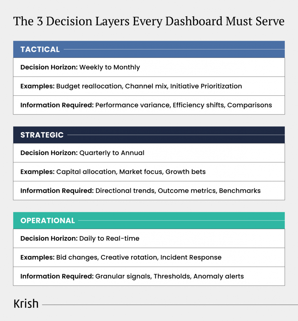
1. Strategic Layer: Quarterly to Annual Horizon
Strategic dashboards exist to support decisions that are expensive to reverse. Capital allocation, portfolio focus, market entry or exit, and long-term growth bets all live here.
At this layer, leaders are not asking what happened last week. They are asking whether the business is moving in the right direction.
What strategic dashboards must provide
- Directional trends over extended time horizons
- Outcome metrics tied to revenue quality, margin, retention, and risk
- Context against targets, historical baselines, and external benchmarks
- Low refresh cadence that preserves signal integrity
Research on executive decision-making consistently shows that leaders make better strategic judgments when information emphasizes trajectory over volatility. Yet many strategic dashboards are cluttered with operational detail. Daily transaction counts, campaign-level metrics, and short-term fluctuations compete for attention with long-term signals.
The result is predictable. Pattern recognition breaks down. Executives spend time filtering noise instead of evaluating direction. Decisions slow, and confidence shifts from data back to instinct.
2. Tactical Layer: Weekly to Monthly Rhythm
Tactical dashboards sit between intent and execution. This is where strategy becomes adjustment.
These dashboards support decisions such as reallocating budget, changing channel mix, prioritizing initiatives, or addressing underperforming segments. The decisions are frequent and reversible, but they materially affect outcomes.
What tactical dashboards must provide
- Clear variance from expected performance, not raw totals
- Efficiency trends across channels, products, or regions
- Comparative views that support prioritization
- Regular refresh cycles aligned to planning cadence
Industry studies on managerial dashboard usage show that dashboards are most effective at this layer when they emphasize deviation and leverage, not status. Leaders want to know where performance is drifting and which lever will have the greatest impact.
Tactical dashboards fail when they copy strategic views without enough resolution to act, or when they inherit operational detail so dense that meaningful patterns disappear. In both cases, the dashboard explains performance but does not guide adjustment.
3. Operational Layer: Daily to Real-Time Response
Operational dashboards exist for one purpose: intervention.
Frontline teams do not need summaries. They need signals that tell them when something is wrong and what action to take.
Research into operational analytics consistently shows that real-time dashboards deliver value only when they are tightly coupled to specific actions. When dashboards aggregate signals into averages or summaries that require interpretation, response time degrades and value is lost.
What operational dashboards must provide
- Single-purpose metrics tied to clear actions
- Thresholds that distinguish normal from abnormal behavior
- Real-time or near-real-time refresh
- Minimal context beyond what is required to act
The most common failure pattern is operational dashboards that look analytical but behave like reports. When teams must stop to interpret before acting, the dashboard has already failed its primary function.
The Architectural Insight
The critical insight across all three layers is simple but powerful:
Dashboards must be designed backward from the decision window, not forward from available data.
When each decision layer receives signals matched to its timing, risk, and reversibility, dashboards stop being passive reporting tools. They become instruments of control. When they do not, organizations end up with more dashboards, more meetings, and less decisiveness.
Separating dashboards by decision layer solves only the structural problem. Very quickly, another issue surfaces: even the right dashboard fails when it carries the wrong metrics. Dashboards inherit their power and their limitations from the KPIs they display. If those KPIs are misaligned, better structure simply delivers clearer confusion.
KPI Design as a Strategic Constraint, Not a Reporting Exercise
KPIs do more than measure performance. They shape behavior, incentives, and trade-offs across the organization. That is why KPI design is a strategic decision, not a reporting task.
- The Vanity Metric Trap and Why It Persists
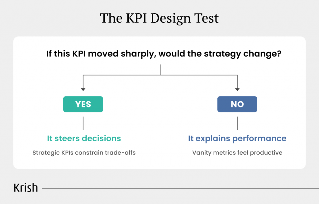
Most KPI systems grow bottom-up. Teams track what is easy to measure or historically reported, and those metrics harden into dashboards and reviews. Over time, activity becomes a proxy for progress. Vanity metrics survive because they look productive, trend upward, and rarely force uncomfortable conversations. The decisive test is simple: if this metric moved sharply, would the strategy change? If not, it informs but does not steer. - The Alignment Tax of Fragmented KPIs
Misaligned KPIs impose a real cost. Marketing optimizes for volume, sales for quality, product for adoption, and customer success for retention. Each function hits its targets, yet enterprise performance stalls because decisions cancel each other out. When KPIs do not reinforce shared objectives, coordination breaks down and accountability diffuses. - Why Complexity Builds Credibility
High-maturity organizations design KPIs top-down. Metrics cascade from strategic goals and constrain choice by making trade-offs explicit. Increasingly, leaders rely on higher-complexity metrics such as lifetime value, cohort retention, and incremental impact. These measures are harder to compute, but they earn trust because they map directly to economic reality rather than activity. - KPIs as Hypotheses, Not Facts
The most effective organizations treat KPIs as hypotheses about what drives outcomes. They test them, refine them, and discard them when evidence changes. A simple commitment question keeps this discipline sharp: if these KPIs disappeared tomorrow, would our decisions change? If the answer is no, the organization is measuring performance without steering it.
Designing the right KPIs solves the question of what should matter. It does not solve how quickly leaders can recognize that it matters. In most organizations, the delay between signal and understanding is where decisions stall. Metrics may be correct, aligned, and strategically sound, yet still fail to influence outcomes because they take too long to interpret in the moment.
At that point, the bottleneck is no longer measurement. It is cognition.
Designing Dashboards for Instant Judgment
In leadership reviews, dashboards are consumed under time pressure. When meaning is not immediately obvious, conversation shifts from what should we do to what are we looking at. At that point, dashboards explain performance, but they no longer influence outcomes.
Effective dashboards are designed for instant judgment. They make the most important signal obvious at first glance, without requiring interpretation. Visual hierarchy does this work quietly, using size, position, and contrast to guide attention before conscious analysis begins. When hierarchy is weak, leaders are forced to scan and compare, increasing cognitive effort and delaying decisions.
- Completeness is often mistaken for confidence.
Many dashboards attempt to show everything at once, assuming more data builds trust. In practice, this creates noise. Leaders spend time filtering instead of deciding. Progressive disclosure works because it surfaces only the few signals required to judge the situation, while still allowing depth when a decision demands it.
- Context is what turns numbers into meaning.
A change has no value unless it is anchored to what was expected, what came before, or what threshold matters now. Dashboards that provide this context remove interpretation work from the reader and accelerate understanding.
- Simplicity does not mean oversimplification.
High-quality dashboards present complexity in a way that the brain can process quickly. They avoid decorative elements that compete for attention and reserve visual emphasis for deviation, risk, and opportunity.
When dashboards are designed for instant judgment, they stop explaining performance and start enabling decisions. Yet even the clearest dashboards still depend on someone noticing change. That dependency becomes the next constraint.
From Passive Dashboards to Active Decision Triggers
The highest-performing organizations have stopped asking what does the dashboard show? and started asking what should the dashboard do?
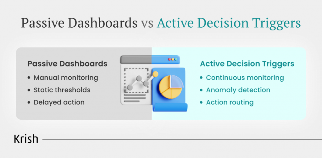
Passive dashboards depend on humans to monitor, interpret, and initiate action. Active dashboards operate differently. They monitor continuously, interpret signals automatically, and trigger intervention when meaningful deviations emerge.
Why Traditional Alerts Fail
Most organizations rely on fixed thresholds. This works only when metrics behave predictably. In reality, business signals fluctuate by time of day, seasonality, growth phase, and channel mix. A conversion rate that signals risk on a weekday morning may be perfectly normal on a weekend evening.
Static thresholds generate noise. Noise trains teams to ignore alerts. Over time, trust erodes and genuinely critical signals get buried.
The Shift to Statistical Anomaly Detection
Effective decision triggers learn what “normal” looks like and surface only deviations that matter. Instead of flagging every threshold breach, anomaly detection identifies patterns that fall outside expected behavior.
This enables:
- Seasonality-aware detection across daily, weekly, and monthly cycles
- Trend-adjusted thresholds that evolve with growth
- Multi-signal correlation, not isolated metric changes
- Severity-weighted alerts based on deviation magnitude
The False-Positive Tax
False positives are more damaging than missed alerts. When most alerts resolve to “within normal variance,” stakeholders stop paying attention. Calibration matters. Alerts must reflect real business tolerance, not generic statistical limits.
From Detection to Intervention
Detection alone does not create value. Decision-grade dashboards close the loop:
- Anomaly detected
- Context assembled automatically
- Alert routed to the decision owner
- Recommended actions surfaced
- Outcomes fed back to improve future responses
At this point, dashboards stop being reporting tools. They become real-time decision infrastructure.
The operational test is simple
How many critical decisions happen because someone checked a dashboard versus because a dashboard triggered action? The answer reveals whether analytics is passive or truly operational.
Conclusion: Making Dashboards Part of the Operating Model
Dashboards drive decisions only when they are designed for how decisions actually happen. Separating views by decision layer creates clarity. Choosing KPIs that constrain trade-offs restores strategic focus. Designing for instant judgment accelerates understanding. Activating triggers shifts teams from observation to intervention.
But none of this works unless dashboards are embedded into the operating rhythm. When dashboards align with decision cadence, have clear ownership, and connect insight directly to action, they become decision infrastructure. When they do not, they become historical records.
The difference is simple: dashboards that change behavior create value. Dashboards that only display data do not.
With that, this episode showed that decision maturity is not just about having abundant dashboards. Up next, we will discover ‘The Data Silo Problem: Why Your Teams See Different Truths’. Stay tuned for our MarTech Masterclass episode 6.
Table of Content
- The Dashboard Confidence Trap
- Where Decisions Actually Happen Versus Where Dashboards Stop
- The 3 Decision Layers Every Dashboard Must Serve
- KPI Design as a Strategic Constraint, Not a Reporting Exercise
- Designing Dashboards for Instant Judgment
- From Passive Dashboards to Active Decision Triggers
- Conclusion: Making Dashboards Part of the Operating Model
Subscribe with Us!
Never miss any post, stay tuned!

Ankit helps brands navigate their digital maturity journey by bringing together analytics, CRO, ML, and AI in a practical, business-friendly way. Having worked with global teams across industries, he focuses on simplifying complex MarTech concepts and turning them into measurable outcomes. On weekends, you’ll likely find him deep in a reflective read or sharing a coffee with a client while simplifying MarTech in the most human way possible.
Recommended Reading:
Predictive Analytics 101: Moving From Hindsight to Foresight – MarTech Masterclass Series Ep | 19
9 July, 2026 Most MarTech stacks are architecturally optimized for one thing: describing the past. Revenue last quarter, churn in the last 90 days, campaign performance last week - the dashboards are polished and the data looks clean. Yet every output from that stack is a response to something that has already happened. The customer already churned. The demand spike already passed. The high-value cohort already drifted before anyone noticed.
Subscribe with Us!
Never miss any post, stay tuned!
Trusted by leading brands


