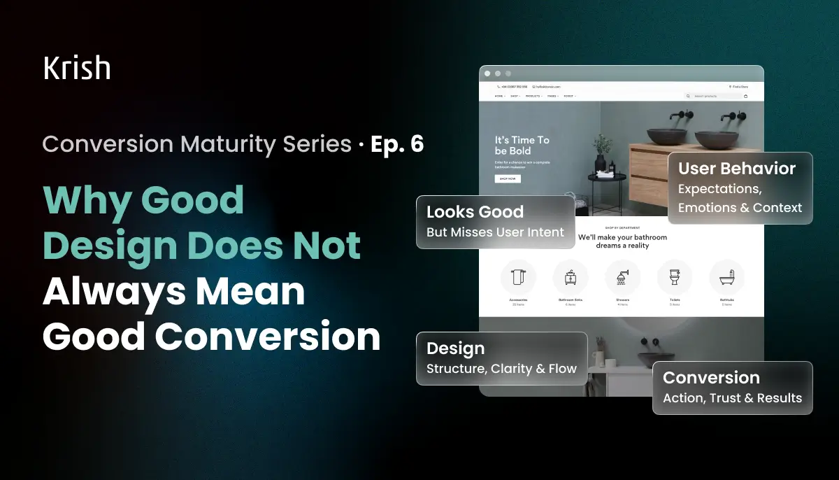
Two Things that Look the Same but Aren't
The most frustrating CRO finding is a page with strong brand metrics and a broken conversion rate. The design team is proud of it. Users find it beautiful. And still, the majority of them leave before buying.
A design that wins awards and a design that converts are built around fundamentally different questions.
Award-winning design asks: does this feel right? Is the hierarchy elegant? Does the brand come through? Does the visual language hold across devices?
Converting design asks: can this visitor take the next step without thinking about it?
These questions produce different pages. Not always, but frequently enough that conflating them is one of the most expensive assumptions in digital commerce. The evidence is precise:
Nielsen Norman Group’s research on the aesthetic-usability effect found that when users have a positive emotional response to visual design, it makes them more tolerant of minor usability issues. This effect is a major reason why a good user experience can’t just be functional. Even when users consciously tried to evaluate functionality, they were still strongly influenced by how the interface looked.
Aesthetics shapes perception. But it does not fix function.
Nobody asks the one question that determines whether any of it produces revenue: Does this make it easier for a visitor to take the next step?
Those two things, looking exceptional and enabling decisions, are not the same. And the cost of confusing them shows up in your conversion rate months after the applause in the approval meeting fades. That’s the discussion this issue addresses: the difference between design that wins aesthetics approval and design that drives conversion, and more importantly, where is that sweet spot and how to achieve that.
UI Is Becoming a Commodity
In January 2026, Nielsen Norman Group’s annual State of UX report made a blunt assessment: “UI is still important, but it’ll gradually become less of a differentiator. As AI-powered design tools improve, the power of standardization will be amplified and anyone will be able to make a decent-looking UI.”
That is the world’s foremost UX research organization telling the industry that visual quality is becoming comparatively easy to achieve. Not irrelevant, just no longer a competitive advantage.
The commercial implication is direct: if visual polish is converging across sites, the gap between a high-converting site and a low-converting one is no longer a design gap. It is a decision architecture gap. The question shifts from “does this look premium” to “does this make it structurally easier to decide, trust, and act than our competitors’ sites?”
Most ecommerce teams are still answering the first question while the second one determines their revenue.
Why Beautiful Sites Still Underconvert
The mechanism is documented and specific. Nielsen Norman Group defines the aesthetic-usability effect precisely: users tend to perceive attractive products as more usable, believing that things that look better will work better, even if they are not actually more effective or efficient.
This means every stakeholder in the design team is running the same cognitive bias as a first-time visitor. The redesign looks more usable than it is. The conversion rate does not move. Nobody has the framework to explain why, because the evaluation tool was the same one that produced the misevaluation.
The effect has a documented ceiling: a pretty design can make users forgiving of minor usability problems, but not of large ones.
Two documented usability test cases illustrate exactly how this plays out in practice:
- A participant testing the FitBit website encountered issues ranging from minor interaction design annoyances to serious navigation flaws. She completed her task with difficulty. In the post-task questionnaire, she rated the site’s ease of use very highly and commented: “It’s the colors they used. Looks like the ocean, it’s calm. Very good photographs.” The positive emotional response masked the usability issues entirely.
- A participant testing Arcadis, a consultancy site using large background photos throughout, responded positively at first: “First thing, popping into this webpage, I see this beautiful, colorful image.” After struggling to complete several tasks, he revised his opinion: “I feel like the whole screen being taken by this is pretty awesome once… And probably annoying the second time.”
Both pages converted the first impression, but neither converted the task – that’s the gap we need to address.
Further Reading
GA4 Shows the Drop. It Doesn't Show the Cause.
The five-layer analytics stack only produces actionable insight when the data beneath it is being read correctly. This post explains why standard funnel drop-off metrics consistently mislead optimization decisions, and which behavioral signals to layer on top of GA4 data to find what actually caused the revenue leak.
Read the full blog →Where Design and Conversion Diverge on a Product Page
Nielsen Norman Group is explicit:
“Form and function should work together. When products suffer from severe usability issues, or when functionality is sacrificed for aesthetics, users tend to lose patience.”
On an ecommerce product page, those trade-offs happen at 5 specific decision points. Each one is made implicitly, every time a page is designed.
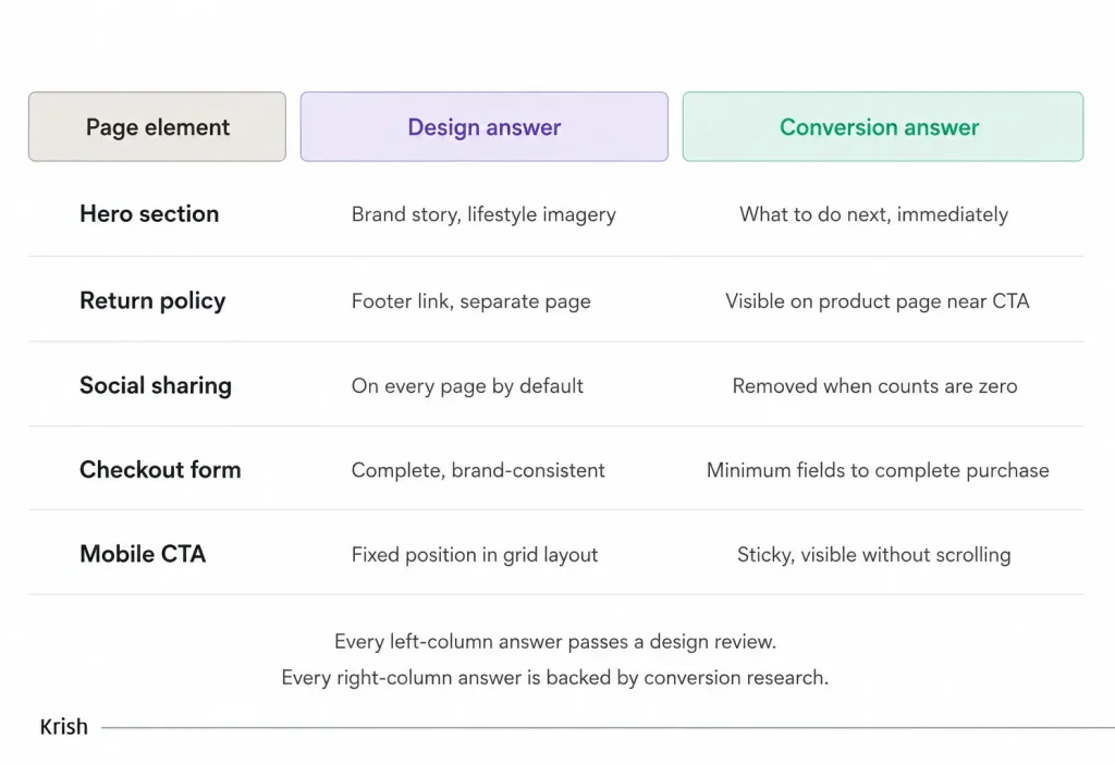
Take the social sharing row specifically. Social sharing buttons appear on nearly every ecommerce product page template. They signal modern platform thinking, complete the design system, look considered. But when share counts are zero or hidden, they do not say “share this.” They communicate “nobody cared enough to share this.” That is negative social proof embedded directly in the page layout, in the same space a trust signal should occupy. Removing them is documented to lift add-to-cart rates. Nobody catches this in a design review because design reviews do not look at what empty count badges communicate to a real visitor.
The Specific Behaviors That Reveal the Gap
Here is what the conversion research shows happens on real product pages of well-designed ecommerce sites:
- Visitors arrive from paid search on a product page and encounter a full-screen brand image above the fold. The product specification is three scrolls down. They exit before finding it. The page looked beautiful. It never answered the question they came with.
- A visitor reaches the checkout form. It asks for a phone number in the third field. They stop. The phone field is not required for the transaction. It exists because someone in the CRM team asked for it at a meeting two years ago. The design team built it cleanly. The conversion team never removed it.
- A visitor on mobile reaches the add-to-cart button at the bottom of a long product description. They scroll back up to re-read the price. The CTA is gone. They exit. The desktop experience was beautiful. The mobile experience was a direct transcription of it.
- A visitor looks for the return policy before committing to a £180 purchase. It is in the footer. They leave rather than hunt for it. The policy itself was generous. Its placement made it invisible at the moment it mattered.
None of these is a design failure in the aesthetic sense. All of them are conversion failures in the structural sense. And,
Baymard Institute’s research calculates that the average large ecommerce site can achieve a 35% increase in conversion rate through better checkout and product page design alone, representing $260 billion in recoverable revenue across US and EU ecommerce.
These sites are not poorly designed. They are structurally misaligned at the decision layer
Further Reading
How to Track Funnel Drop-Offs in GA4: Step-by-Step Guide for Ecommerce
Predictive churn models detect disengagement signals before customers go dark. But you first need to know where users are dropping off. This GA4 guide walks through how to build that visibility into your funnel, step by step.
Read the full blog →The Agentic Commerce Pressure Already Building
One more dimension worth naming directly. As Nielsen Norman Group’s 2026 assessment puts it, AI-mediated interactions now sit atop the interface itself:
The screen matters less when users talk to an agent instead of navigating pages.
AI agents navigating product pages on behalf of users evaluate them on structured data alone: is price machine-readable, are specifications complete and parseable, is the add-to-cart element semantically labeled, is the return policy in accessible text. A lifestyle hero image communicates nothing to an agent. A CTA styled as a div rather than a semantic button may not be recognized as an action. A return policy linked from a footer may not be surfaced at all.
The pages that convert in an agentic commerce environment are identical to the pages that convert for human visitors: clear, complete, decision-sequenced, and structurally sound beneath the visual layer.
Aesthetic compensation has no value for an audience without an aesthetic response.
Krish’s AI and data capabilities and ecommerce personalization work are built around this convergence as a present requirement rather than a future consideration.
Talk to Our ai consultant Experts
Is Your MarTech Stack Ready to Run on AI?
Most enterprise MarTech stacks collect the right data but lack the architecture to act on it predictively. Krish's AI consulting team assesses your current setup and builds the roadmap to operationalize ML across every marketing channel, starting with email.
Book a Free Consultation →The Question to Ask before Any Redesign
Most redesign briefs ask: Does this look better than what we have?
The more useful question: Does this make the right action easier to take than what we have?
The best conversion-engineered pages are also well-designed, because visual hierarchy, cognitive ease, and clear information architecture are the principles of good design when good design is defined as design that achieves its purpose. The problem is when aesthetics becomes the purpose, and conversion becomes the hoped-for byproduct.
That inversion is where the gap between award-winning sites and high-converting ones quietly opens. A funnel drop-off analysis and a detailed CRO audit are the best ways to find exactly how wide that gap is on your own site before committing a redesign budget to closing the wrong problem.
We’ve mapped your funnel in Issue 01, defined your conversion events in Issue 02, diagnosed behavioral drop-off in Issue 03, and moved towards removing the friction in Issue 04. Issue 05 discussed design psychology, and now here is the assumption that quietly undermines all of it: that a beautiful site is a converting site. In Issue 07, we’ll talk about UX Mistakes That Quietly Reduce Conversion Rates. Stay with us!
Table of Content
Subscribe with Us!
Never miss any post, stay tuned!
Steny Christian helps brands unlock growth by making AI and MarTech practical, strategic, and easier to navigate. With a consultative and people-first approach, he works closely with businesses to simplify digital transformation and drive meaningful outcomes. Outside work, you’ll likely find him exploring emerging tech or sharing thoughtful conversations around innovation and growth.
Recommended Reading:
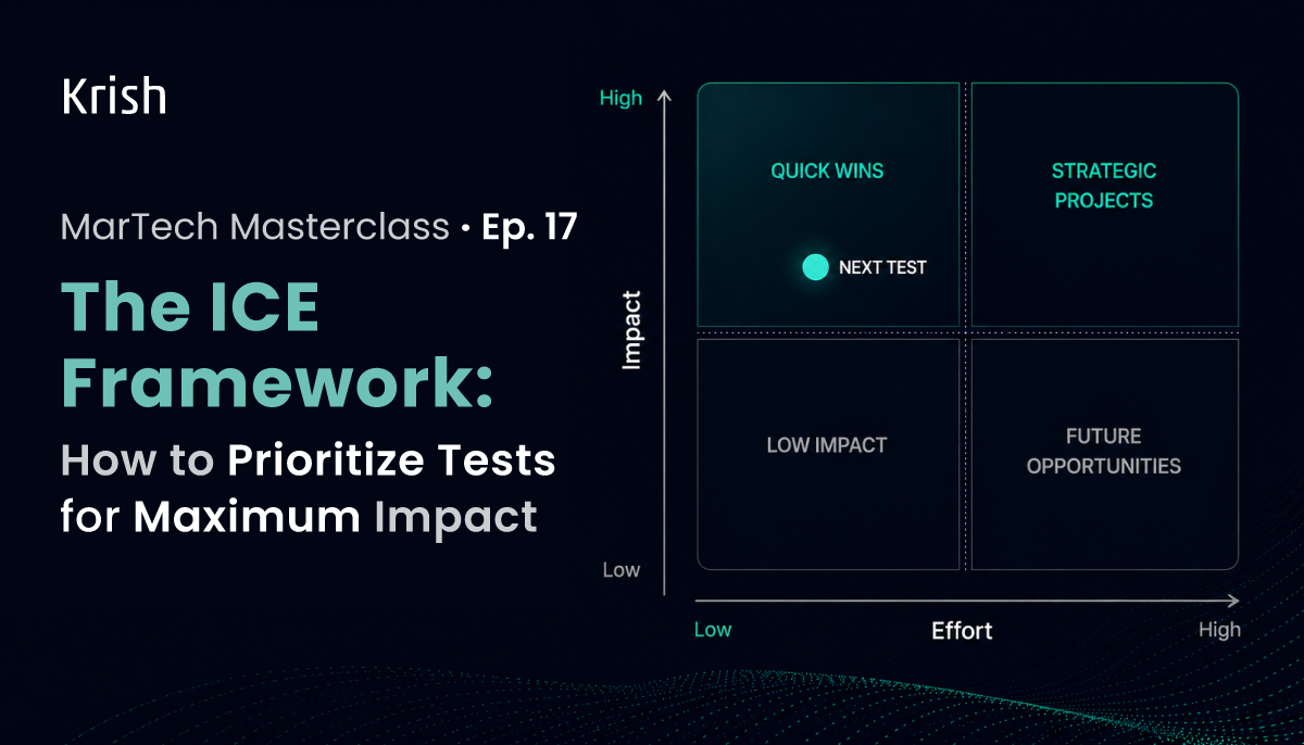
The ICE Framework: How to Prioritize Tests for Maximum Impact – MarTech Masterclass Series Ep | 17
18 June, 2026 Your GA4 funnel exploration is showing a 54% drop between the product page and the add-to-cart on mobile. Session recordings are showing users scrolling past the buy button, looking for delivery information that is not on the page. Your event tracking is capturing rage clicks on a form field that validates inconsistently. The heatmap on the category page shows that 38% of desktop visitors never reach the product grid, and they leave from above the fold. The A/B testing tool has 23 ideas in the backlog, submitted by three teams across four weeks.
Subscribe with Us!
Never miss any post, stay tuned!
Trusted by leading brands


