The Zero-Friction No Conversion Scenario
Friction never announces itself, but psychology never even gets noticed.
A visitor can hit zero friction, fast load, clean form, single CTA, and still walk away unconvinced. Something quieter than friction decided that outcome before the visitor consciously registered the page at all.
Not price, not product, but trust; collapsing at the exact moment of commitment, on a page that did everything else right.
That invisibility is what makes friction so expensive. It doesn’t show up as a line item. It doesn’t trigger an alert. It bleeds revenue in increments small enough to dismiss individually and large enough to matter enormously in aggregate.
You’ve mapped your funnel in Issue 01. You’ve defined what converts in Issue 02. You’ve learned to observe behavior in Issue 03. You’ve removed the friction in Issue 04. Now meet the layer beneath all of it: the psychology that decides whether a frictionless page actually gets believed.
Because the visitor wasn’t slowed down. They were unconvinced.
Further Reading
Funnel Drop-Off Data Misleads: What to Actually Check
A frictionless page can still bleed revenue when the data is pointing you at the wrong problem. This post breaks down why standard drop-off metrics misrepresent where trust actually collapses, and what behavioral signals to look for instead.
Read the full blog →The 7 Psychology Principles, Defined Precisely
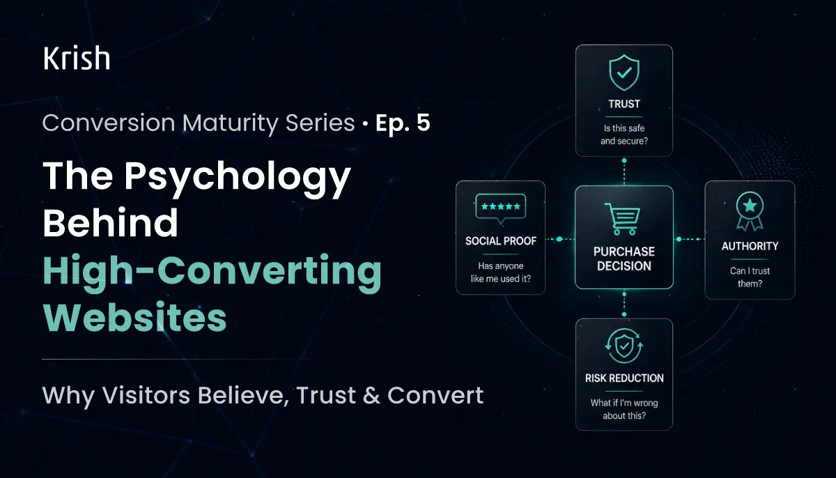
The most expensive mistake in CRO after friction remediation is assuming a clean page automatically reads as a trustworthy one. A visitor doesn’t evaluate your page line by line. They scan it for a small set of signals, and each one answers a specific, unspoken question rather than a generic sense of polish.
The diagram below doesn’t show these signals or principles as a checklist. It shows what specific doubt each one resolves, and what happens when that doubt goes unanswered.
Each of these deserves its own dissection. It’s a diagnostic lens for finding which doubts live unanswered on your funnel right now and why funnel optimization, especially in eCommerce, is much more than what the dashboards show.
What each signal actually does to a visitor
- Trust answers the data-safety question first, because it’s the one that stops a click cold.
A documented test on a checkout page that already had a money-back guarantee, payment trust signals, and a logo, found that adding a single recognizable security trustmark beside the payment icons still measurably reduced cart abandonment and lifted conversion. The existing signals weren’t wasted. They simply weren’t answering this specific fear.
The lesson: a refund guarantee does nothing for a visitor whose actual hesitation is about payment security, not regret.
- Social proof answers “has anyone like me done this?” faster than any argument can.
A visitor weighing an unfamiliar decision defaults to the behavior of others rather than independently evaluating the offer. This isn’t a shortcut born of laziness. It’s an efficient response to uncertainty. The specific version matters more than the principle: a review naming a real, checkable outcome does this work. A vague five-star average does almost none of it.
- Authority lets a visitor stop verifying you and start believing you.
A credential, a press mention, a cited statistic transfers credibility from a trusted third party directly to your offer. The failure mode is placement, not absence. An authority signal placed below the fold or three clicks from the decision point never reaches the visitor before the decision is already made.
- Clarity removes the “what am I supposed to do” hesitation before it forms.
A visitor who has to reread a headline or hunt for the next step has already paid a cost most pages never recover. The test: cover everything except your hero headline. If a stranger needs a second read to know what you do, for whom, and what changes for them, that’s your highest-priority fix, ahead of layout, ahead of color, ahead of imagery.
- Cognitive ease decides whether anything above even gets processed.
A page that’s hard to parse forces a visitor into effortful, skeptical thinking exactly when you need them to decide on instinct. Every unnecessary field, every competing CTA, every dense paragraph is a tax that depletes the attention needed for the decision that actually matters.
- Risk reduction answers “what if I’m wrong about this” at the final hesitation point.
Free trials remove financial risk. No-contract terms remove commitment risk. Clear refund language removes regret risk before it forms. Each only works when stated exactly where the decision is happening. The same guarantee buried in an FAQ does a fraction of this work.
- Reassurance is the signal almost no CRO program measures, because it happens after the conversion is already counted as a win.
The confirmation message, the immediate follow-up, the first few minutes post-click: each either confirms the visitor made the right call or quietly reopens the doubt that was never fully resolved. Ignoring this stage is how converted revenue leaks back out as cancellations and refunds.
Why Brands Consistently Underestimate the Psychology Layer?
The diagnostic failure isn’t that brands ignore psychology entirely. It’s that they evaluate trust, proof, and clarity as a single undifferentiated category, stack a few signals onto the page, and call it done. A guarantee badge and a security badge get treated as interchangeable trust elements when they answer entirely different fears.
This is exactly why Stripe’s own checkout guidance separates trust into distinct categories rather than one pile: familiarity through recognizable payment logos, security cues like lock icons, transparency on pricing shown before the final screen, and professional polish in layout and copy, each resolving a separate concern. A page can have all four and still fail if none of them sit at the point in the journey where the matching doubt is actually live.
This is why a funnel drop-off analysis that maps the entire journey, not page-level snapshots, surfaces psychological gaps that isolated audits miss. And why a CRO audit combining behavioral observation from Issue 03 with this fear-mapping discipline produces fixes that move revenue, not just page aesthetics.
Fixing psychology is not a copywriting pass. It is a revenue recovery program, the same as friction remediation in Issue 04, just one layer deeper.
Top Brand Use Cases of Winning with Psychology Principles
None of the principles is interchangeable, and the four documented cases below prove exactly that: each one moved a real number by fixing one specific principle, not by adding more of everything. (This is a case study compilation from VWO)
1. IMB Bank: clarity and risk reduction on a loan application form
IMB Bank’s funnel analysis showed approximately 37% of users dropping off the first page of their personal loan application form, despite high apparent intent since users were actively starting the form-filling process. The cause was too many fields requesting information visitors weren’t ready to provide, combined with confusing navigation that left users unsure what came next.
The fix redesigned the form into a multi-step flow with clear progress indicators, reduced required fields on early pages, improved navigation clarity, and added trust signals to reassure applicants that their information was secure.
The result: an 87% increase in completed applications and a 9% improvement in form completion rate.
This proves clarity and risk reduction working together. Progress indicators are clarity; a visitor always knows what comes next. Reduced early-stage fields and added security signals are risk reduction, lowering the perceived cost of starting something the visitor isn’t sure they can finish safely.
2. WikiJob: social proof, isolated and tested on its own
WikiJob tested adding three lines of customer testimonials to a page, despite a previous test that placed the same testimonials further down the page and saw no discernible impact on conversion. The repositioned testimonials increased purchases by 34%, and according to WikiJob, the testimonials worked because they were deliberately sober rather than overly enthusiastic.
This proves social proof specifically, and proves something sharper: the same content, in the wrong position, did nothing. Placement is not decoration. It’s the difference between a signal that gets seen at the decision point and one that doesn’t.
3. A VWO field test: when the wrong trust signal hurts you
A lead generation form tested with and without a TRUSTe security logo found that the variation without the logo got 12.6% more completed forms. The reasoning: visitors expect to see that seal in a shopping cart at the point of payment, not on a top-of-funnel lead form, and seeing it there likely triggered an unconscious suspicion that a payment transaction was about to occur.
This is the clearest proof available that trust signals are not universally additive. The same badge that resolves a payment-safety fear at checkout actively created a new fear, “wait, is this asking for my card,” on a page where no such fear should have existed. The principle didn’t fail. The placement did.
4. Ubisoft: cognitive ease, by removing rather than adding
Ubisoft’s “For Honor” Buy Now page wasn’t converting well. Investigation using click maps, scroll maps, heatmaps, and surveys found the buying process was too tedious, so the team reduced page scroll and simplified the buying process. After the simplification, conversions rose from 38% to 50%, and overall lead generation increased by 12%.
This proves cognitive ease directly: the fix wasn’t a new persuasive element, it was the removal of friction-inducing scroll and steps. Less to process meant more conversions, the opposite instinct of stacking on more reassurance.
Further Reading
Conversion Rate Optimization Best Practices to Boost Revenue
The four documented cases in this section all prove the same thin gone principle, placed precisely, moves a real number. This post extends that discipline into a full CRO best practices framework: from trust signal placement and form simplification to benefit-based messaging and structured A/B testing.
Read the full blog →Three Checks to Run this Week
- List every trust or persuasion element on your highest-traffic page. For each one, name the specific unspoken question it answers. Anything you can’t name a question for is decoration, not a working signal.
- Cover everything on your homepage except the hero. Can a stranger tell, in one read, what to do next, the way Zoom’s two-button hero does? If it takes a second read, that’s your highest-priority fix this week, ahead of layout or color.
- Identify your biggest switching-cost objection, the reason someone would stay with what they already use. Check whether your page addresses that directly, the way Basecamp’s “you wouldn’t be here if it was working” line does, or whether it only lists features and assumes the comparison makes itself.
Further Reading
Funnel Drop-Off Analysis: How to Identify Where You're Losing Conversions
Most ecommerce stores lose customers at the same funnel stages, but never know why. This guide walks you through funnel drop-off analysis to spot the exact leaks and fix them before they cost you more sales.
Read the full blog →Issue 06 takes this directly into a tension most teams never resolve: why a page that wins design awards can still fail every question above, and what actually separates visual polish from a page engineered to be believed.
Further Reading
CRO & A/B Testing Services
Running the three checks manually is the diagnostic. Testing the fixes is where revenue recovery actually happens. Krish's CRO and A/B testing practice takes the doubt-mapping discipline from this issue and runs structured, hypothesis-driven experiments, so every psychology signal you fix has a measured outcome attached.
Explore the service →Table of Content
Subscribe with Us!
Never miss any post, stay tuned!
Digital transformation expert and trusted advisor to global brands. With a career dedicated to navigating tech's evolution, she's led successful initiatives, driving businesses into the ecommerce future. Beyond the boardroom, she finds solace in mountain retreats, cherishing moments of inspiration with a bowl of Maggi. Whether crafting strategies or exploring new heights, Shruti's journey exemplifies innovation, resilience, and a zest for life's adventures.
Recommended Reading:
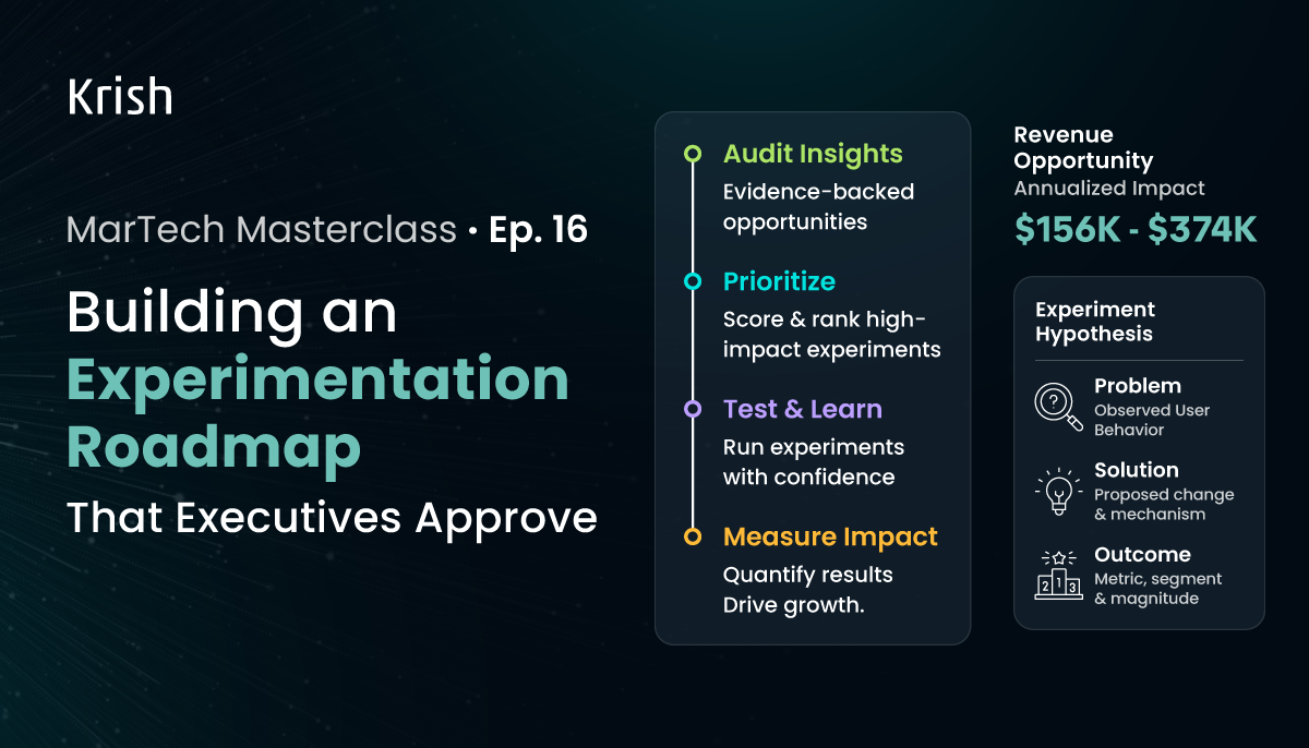
Building an Experimentation Roadmap That Executives Approve – MarTech Masterclass Series Ep | 16
9 June, 2026 In our previous MarTech Masterclass Episode 15, we provided a detailed breakdown of how to run a CRO audit. We mapped where intent dies across landing pages, product pages, and checkout. None of those are traffic problems. They are funnel problems, and the audit is what exposes them.
Subscribe with Us!
Never miss any post, stay tuned!
Trusted by leading brands


